


In the world of customer retention, building a loyalty program that stands out is a major endeavor for any company. Loyalty programs can be a game-changing opportunity if created with care and precision. However, taking the first step is often the most daunting, due to the many decisions that need to be made around your rewards program.
Still, if you’re reading this, then you’re undoubtedly determined to get to the bottom of things. And you’ve come to the right place! This article is a 360-degree look at customer loyalty programs. Here you’ll learn:
- How to create a loyalty program concept that goes beyond the tried and tested
- Which type of loyalty program and features are the best fit for your business
- How to avoid the most common and most dangerous loyalty program mistakes
- How to plan, design and manage a high-performing loyalty program with a positive ROI
- And much more!
Success lies in understanding the market and your customers. With our help, you can be an expert in all things loyalty programs, too. So let’s dive into it!
You can also check out our Loyalty Program Concept Worksheet that will help you think through the key characteristics of your future loyalty program.

Table of Contents
What Are Loyalty Programs and Why Are They Relevant in 2023?
Loyalty programs have been around for decades, if not a full century. Though it all may have started with a simple idea (probably in a coffee shop somewhere) showing a small token of appreciation to customers for their purchases, the concept has evolved tremendously — especially over the past few years. As such, the topic of customer loyalty programs deserves a little bit of attention, so that you know why Loyalty 1.0 and 2.0 are outdated, and what kind of new KPIs are being driven thanks to the latest advancements in the technology.
Building Customer Loyalty in the Current Market Environment
Today’s customer expectations are higher than ever. Research conducted by Salesforce states that 72% of marketers say meeting customer expectations is more difficult than it was before. When asked, shoppers say they want many things: a quick, hassle-free shopping experience, monetary benefits, quality products, etc. But the thing they really crave the most is novelty.
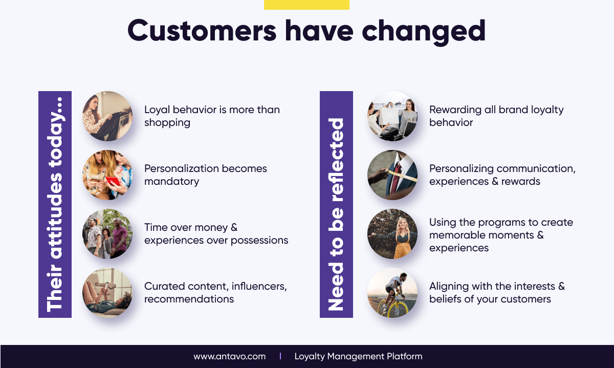
Even though modern customers are willing to switch brands after a single bad interaction, if you can offer them exciting, meaningful experiences, they will stay with you forever. That’s what customer loyalty means in 2023: a long-lasting bond between customers and companies, full of new and meaningful experiences. But how can you achieve this? Here’s a list of trends worth keeping in mind:
- Now, being loyal means much more than simply buying products. Companies should therefore reward all sorts of activities.
- Personalization has become essential, so it should be extended to rewards, the shopping experience, and even how you communicate.
- Saving time is more important than saving money. Moreover, consumers view experiences as being more valuable than possessions. Make sure to simplify the experience and create memorable moments.
- Customers wish to consume curated content, so they seek out influencers and authentic recommendations. And according to Ogilvy, for every channel where influencer marketing is added has the potential to increase ROI by up to 30%.
Defining the Term: Customer Loyalty Program
Despite being a commonly used term, everyone has a different interpretation of what a loyalty program is. So what are customer loyalty programs exactly?
- Wikipedia: A loyalty program is a structured marketing strategy designed to encourage customers to continue to shop at or use the services of businesses associated with the program.
- Investopedia: Loyalty programs, sponsored by retailers and other businesses, offer rewards, discounts, and other special incentives as a way to attract and retain customers.
- Gartner: Loyalty programs are a mechanism for growing revenue from existing customers, a conduit to customer data and an incentive for customers to self-identify at brand touchpoints, etc.
- Salesforce: A customer loyalty program is a marketing approach that recognizes and rewards customers who purchase or engage with a brand on a recurring basis.
These are excellent definitions, but they only scratch the surface of what a loyalty program is capable of. Antavo’s definition goes beyond to say:

A loyalty program is a marketing tool that helps brands, products and service providers change customer behavior as well as build deeper emotional connections with them – both in and out of the buying cycle, across online, in-store and mobile channels. This is done through the use of monetary rewards, personalized content, exclusive services and privilege-driven experiences that are aligned with the customers’ lifestyle.
The Benefits of Customer Loyalty Programs
Considering that returning customers spend 67% more than new customers, it’s easy to see why retention is a top priority in loyalty programs. Still, well-designed loyalty programs are capable of driving a variety of other business KPIs, such as:
- Higher lifetime value: A loyalty program uses various rewards and incentives to get customers to the 2nd and 3rd purchase, or increase their average order value.
- Recurring member interactions: Companies can increase their available touchpoints and engage with customers on a daily basis by introducing a loyalty program that has features such as gamification, badges & challenges, quizzes, etc.
- Social media virality & influencer marketing: Loyalty programs are the perfect tool for rewarding customers who invite their peers, which helps brands increase their credibility. Brands can also generate positive word of mouth by offering influencer-only perks and rewards.
- Data collection & user-generated content: Brands can use customer loyalty programs to entice customers to provide valuable content (reviews, ratings, social media activity), as well as gather valuable zero-party data via gamified surveys.
- Generate a positive ROI: Loyalty programs are capable of generating a positive return on investment, which means they can play an integral role in the marketing strategy.
The History & Evolution of Customer Loyalty Programs
Originally, Loyalty 1.0 was a great differentiator, especially in an age when the internet was less widespread. In the early era of stamp cards and exchanging points for coupons, loyalty programs helped to reduce the cost of discounting, essentially functioning as a cheap currency. But later, when everyone ended up with a wallet full of loyalty cards, the concept no longer felt special. It turned out that customers wanted better rewards for their loyalty.
As loyalty programs that solely focused on financial rewards started losing relevance, the need to evolve from the old school loyalty model became clear. The age of Loyalty 2.0 was all about pathfinding, and bringing new ideas to the table about how to update the formula. This is when we saw the appearance of experiential and partner rewards, data collection and segmented communication, as well as the adoption of various in-store and mobile technologies, eventually setting loyalty programs on the path to omnichannel.
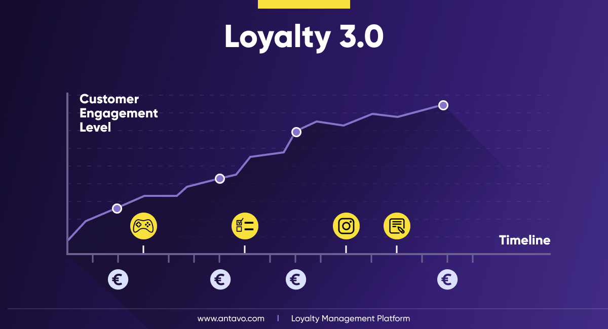
Loyalty 3.0 – The Rise of Emotional, Personalized Reward Programs
Though each innovation proved valuable, Loyalty 2.0 used these new features in isolation, which led to loyalty programs being strong in omnichannel, but lacking in rewards, or vice versa. As such, Loyalty 3.0 was introduced to respond to the attitude that today’s customers crave something that truly resonates with their personalities, and the belief that their loyalty can only be established if a brand’s values align with their own.
The motto of Loyalty 3.0 is that customers should be engaged both inside and outside of the buying cycle. In other words, shoppers should be rewarded for actions that are non-transactional in nature in order to show appreciation, and foster brand love.
Why should you engage customers outside of the buying cycle?
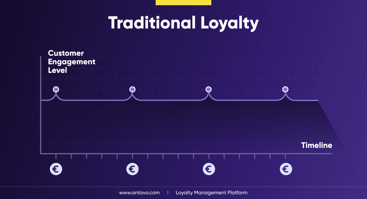
Loyalty 3.0 aims to solve the biggest problem with traditional loyalty programs: low engagement. Rewarding customers only when a transaction takes place severely limits your opportunities to deliver an emotional high because, in most industries, purchase events are too few and far between to keep people engaged.
However, when you recognize the members of your loyalty programs for a variety of interactions – not just transaction-related – they will feel good about your brand far more frequently. These interactions can include contributing user-generated content on social media, writing product reviews, taking a product-related quiz, or referring a friend. Also, you can engage customers in everyday activities, such as going for a run in their new shoes or wearing clothing items with smart tags in them.
The Loyalty 3.0 model
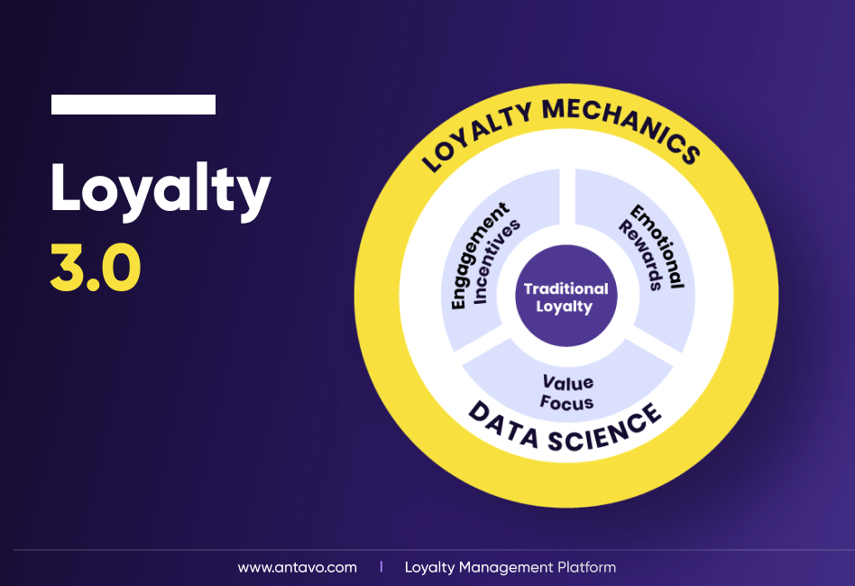
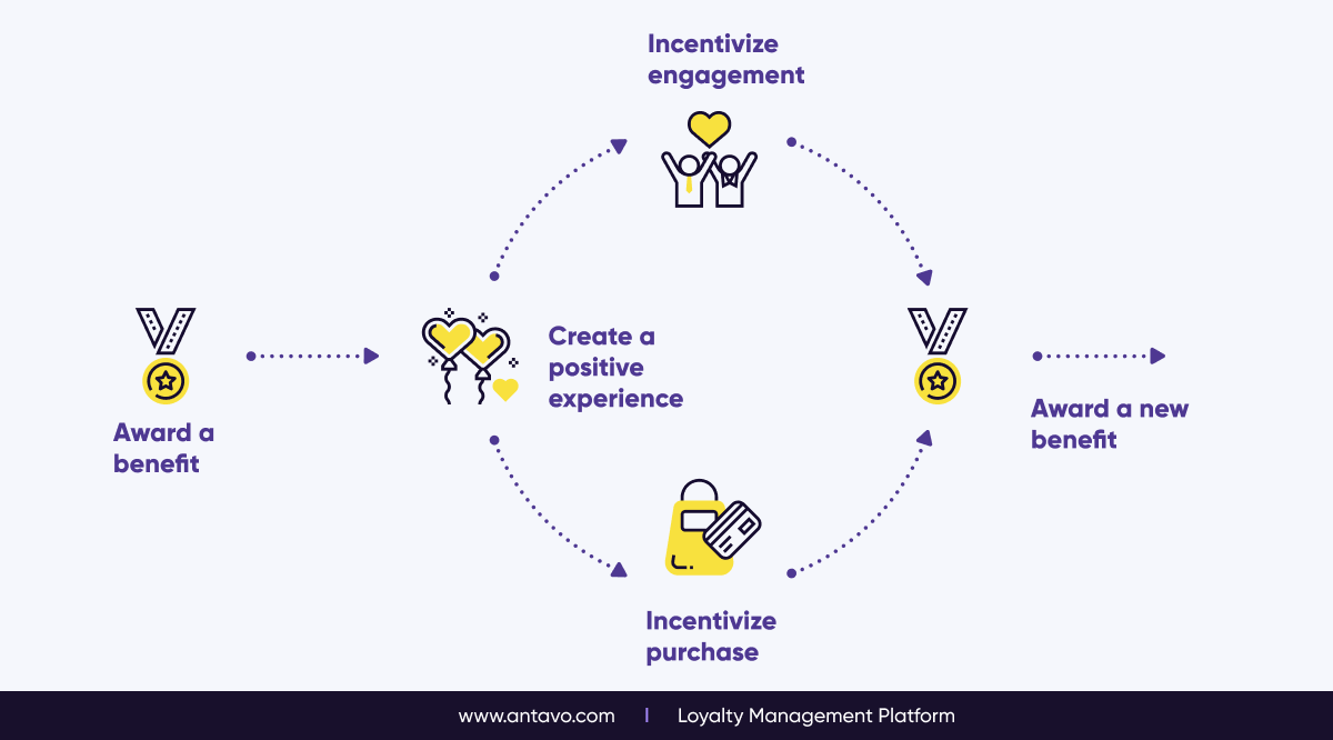
On top of that, Loyalty 3.0 is successful because it unifies everything that came before into a seamless experience.
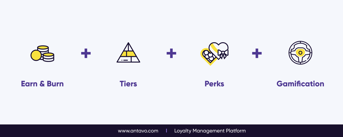
- At its core, Loyalty 3.0 programs still have the traditional loyalty elements, such as points, coupons, etc, however they build upon this foundation by adding engagement incentives (gamification), emotional rewards (non-transactional, experiential rewards), and a value focus (promoting charity and healthy lifestyle).
- All of these elements are packaged with data science (data-driven personalization) and various loyalty mechanics (tiers, badges & challenges).
Customer Loyalty Programs During Times of Crisis
The Covid-19 pandemic has had long-lasting effects on the world, greatly accelerating digital transformation, and permanently altering customer attitudes and behavior. But amidst these customer retention and acquisition challenges, how did loyalty programs perform?
To uncover the exact role and importance of loyalty programs in the recent global crisis, Antavo’s Global Customer Loyalty Report surveyed over 320 corporate respondents. Here’s what we found:
- 60.5% of respondents reported that the Covid-19 crisis “increased” or “significantly increased” the development of their loyalty strategy
- 62.1% of respondents reported that their loyalty program helped keep their customers engaged during the Covid-19 crisis.
- Through Covid-19, members in a higher tier level had a 29.6% higher visit frequency than members in lower tiers.
Maintaining customer loyalty in face of rising inflation
It’s clear that loyalty programs are highly effective tools during any crisis, not just the global pandemic. Mary Pilecki, VP, Principal Analyst of Forrester called loyalty a lifeline for the inflation crisis, urging businesses to retain savvy customers by offering both transactional rewards, like loyalty points, as well as to engage buyers emotionally.
Indeed, during a crisis, customers are more value-conscious than ever, and they are looking for the best deals out there. Loyalty programs that go beyond the buying cycle are especially popular because they allow customers to earn points and rewards without making purchases— an act of generosity that’s especially appreciated during an economic crisis.

Key Takeaways & Actionable Insights
- Fostering loyalty is more than just encouraging customers to buy more
- Customers’ expectations are higher than ever, and one-size-fits-all loyalty solutions are no longer able to satisfy them
- Next-gen loyalty programs are capable of driving a diverse range of KPIs, from data collection to social media virality
- Brands should aim to establish Loyalty 3.0 by going beyond the buying cycle, focusing on the emotional side of loyalty
- Loyalty programs have proven to be especially effective during crises
How to Create a Customer Loyalty Program
Building a loyalty program is a long and intricate process. It involves plenty of research and brainstorming, but also has a technical aspect that requires brands to be aware of their tech stacks and platform capabilities. In order to provide the most comprehensive guide possible, the entire loyalty program creation process was divided into 13 distinct steps.
Step #1: Building the Loyalty Program Concept
Just like any journey, launching a loyalty program should start with a roadmap. The importance of a solid concept should not be understated: the more aspects of the reward program you can establish at this early stage, the fewer surprises or unexpected roadblocks you’ll run into later on.
Exploring the Program Structure
Before jumping into the fun stuff (e.g rewards, gamification, etc.), spend some time laying down the foundations. Some of these might seem obvious at first, but as concept planning starts becoming complex, it’s easy to lose sight of them.
Geographies: Define the list of countries where the program will be initially launched, and in which languages and currencies it will be available in, because these could potentially make management more complex in the future. Also, decide whether you wish to launch in all geographies at once, or start with a single country to gauge the reception.
Basic structure: Come up with a high-level overview of the theme, design and overall feel of the program. This should include a marketable and catchy name not just for the program, but also for the loyalty currency and tiers, if applicable. You should also determine the basic values for how many points the baseline currency translates to (e.g. 1 AUD = 1 point), and how many points are required to reach a higher tier. This might change as the development progresses, but giving it some thought early on helps you stay on top of things.
Channels: Make sure to detail which channels will be involved in the loyalty program, and whether you wish to integrate them to create an omnichannel loyalty program. If you’re planning to launch your loyalty program in multiple stages, specify both the initial channels and the channels that will be introduced in later stages.
Download our loyalty concept worksheet to take the first step towards building your loyalty program blueprint.

Program Logic & Rewards
Defining the program logic is the crux of a smooth customer loyalty program launch. This process will rely heavily on the type of loyalty program you choose, which will be discussed in a later section. Still, here are a couple of concept points to keep in mind.
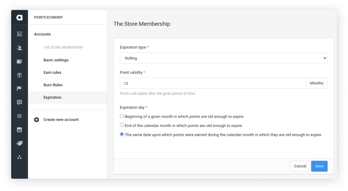
Point logic: If your loyalty program will offer some kind of currency or points, they should come with certain conditions, such as rounding logic, refund rules, expiration dates, etc. You should also dedicate time to calculating how many points additional actions, such as enrolling into the program or writing a product review, should be worth. You should also consider how many points certain rewards will cost.
Tier logic: If you are planning to create a rewards program with tiers, first, you must decide how many tiers you will offer(3-5 is optimal), specify whether the tier system is points-based or spend-based, and what the point / spend range should be for each tier. Also, don’t forget about tier expiration and how members will be downgraded, if applicable.
Rewards: Rewards design will be discussed in detail in a later chapter, but at this point keep in mind that whether you plan to offer monetary rewards like coupons, or more experiential benefits. You should begin to consider costs (both for you and the customer), decide whether rewards can be claimed multiple times by members, and determine whether unused rewards will have an expiration date.
User Journeys & Reporting
Once you have laid down the basic foundation of your program, it’s time to think about the ways customers will engage with it. Smooth user journeys are half the experience.
Enrollment & opt-out processes: Since a good first impression is key to success, it’s important to get the enrollment process right. Best practice usually is to keep the process short, intentionally, to save the customer’s time. Don’t worry about getting all the data you want right off the bat — you can always use gamified surveys to collect additional data later on. As for the opt-out process, even though it’s not a positive experience from the business point of view, it still should be quick and painless for the customer. Consider ways you can learn or benefit from the opt-out process, for example, asking one last question to learn why members have decided to opt out.
Loyalty campaigns: Campaigns are limited-time or segment-specific events that enrich the core experience by offering double points, instant rewards, or other perks. In your loyalty program concept, list any loyalty campaigns that you are planning to launch right after the program goes live.
Challenges: These are a series of actions that members have to complete in order to earn a reward. To plan a challenge, make a list of all of the actions that members will need to complete in each challenge and specify what prize they will receive when they have finished.
Reporting: Wanting to report and track the KPIs only after the program has launched is a common mistake. Monitoring the relevant data points requires a lot of work behind the scenes. Not factoring in reporting capabilities early in the planning process means that you may miss out on valuable data, especially from the early days of the customer loyalty program.
Key Takeaways & Actionable Insights
- Building the concept for your loyalty program should be a detailed and thorough process
- The concept should cover as many program elements as possible to make sure they are figured out in time for the implementation stage
- While working on the concept, think about areas such as geographical markets involved, program (point and tier) logic, user journeys, campaigns and reporting
Step #2: Choosing the Program Type That Fits Best
Customer loyalty programs are like cars: from an outsider’s perspective, they all serve the same purpose. Cars get you from point A to point B, while loyalty programs help you retain customers, right?
However, it’s the small details that make the difference. Loyalty programs can be put into distinct categories, which cater to specific industries and business types. Knowing the different types of customer loyalty programs and which one of them fits your brand the most gives you a headstart in designing your loyalty concept and increases the likelihood of delivering an experience that your customers will truly love.
Antavo’s technology gives you the freedom to choose from 10 different structures or mix and match elements from each.
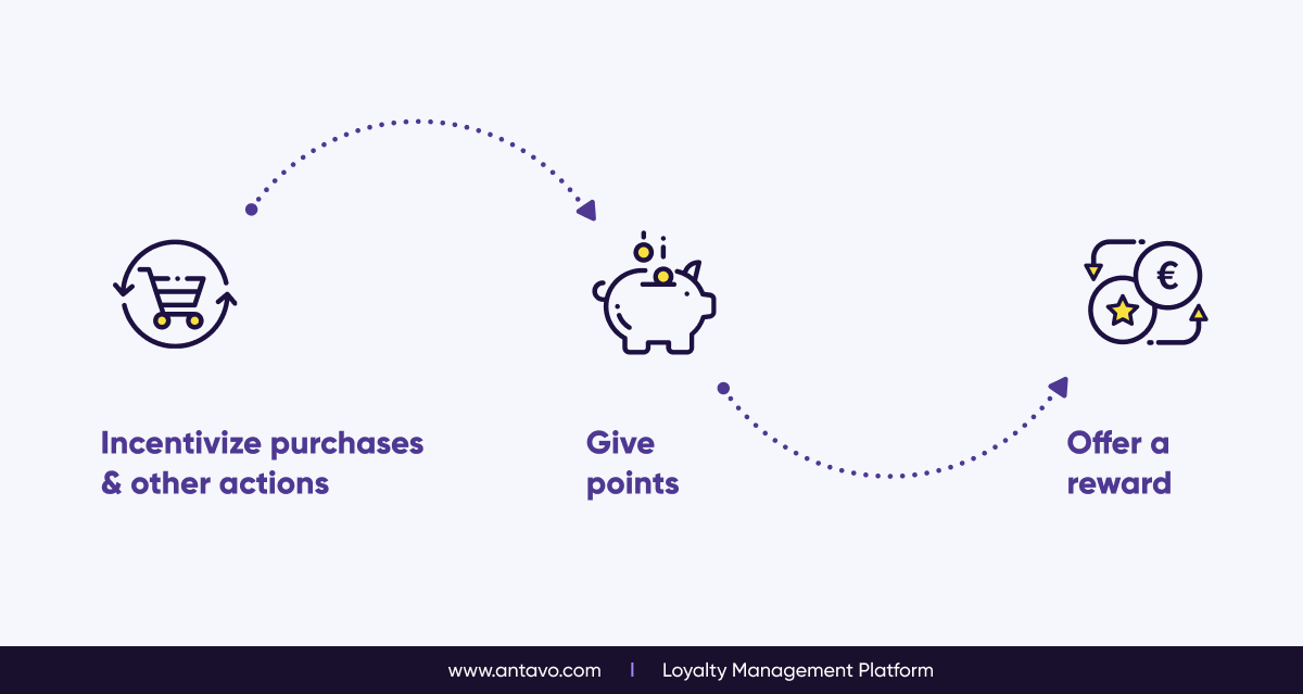
1. Earn & Burn – Reward redemption
Earn & burn is the most common approach to loyalty where customers earn points for spending money or completing other activities. Then customers can exchange their points for rewards. These kinds of programs encourage customers to keep making purchases in order to earn more rewards and see that their spend is valued.
Benefits
- Ease of use: The rules and mechanics are pretty straightforward, easy for customers to quickly grasp them and start using the program immediately.
- Incentivized customer identification: Since all kinds of purchases are rewarded, customers are compelled to identify themselves both online and offline.
- Fast implementation: The relatively uncomplicated nature of earn & burn programs makes the implementation process quicker and easier.
- Convenient and easy-to-budget: These programs are easy to manage because the rate of reward redemption is determined by the available loyalty currency.
- High perceived value: Customers view these rewards as valuable yet easy to achieve, which has a positive effect on engagement rates.
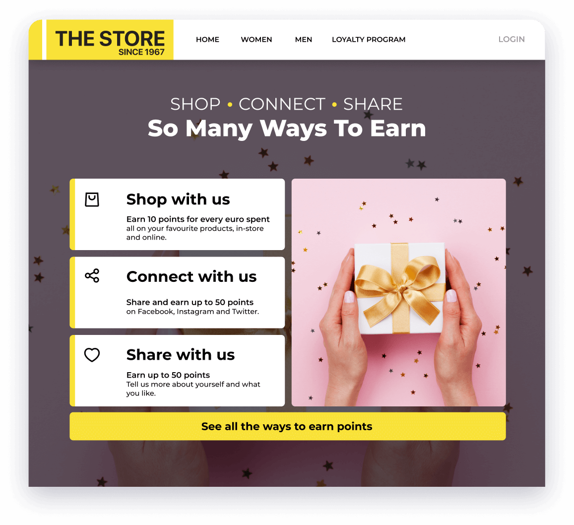
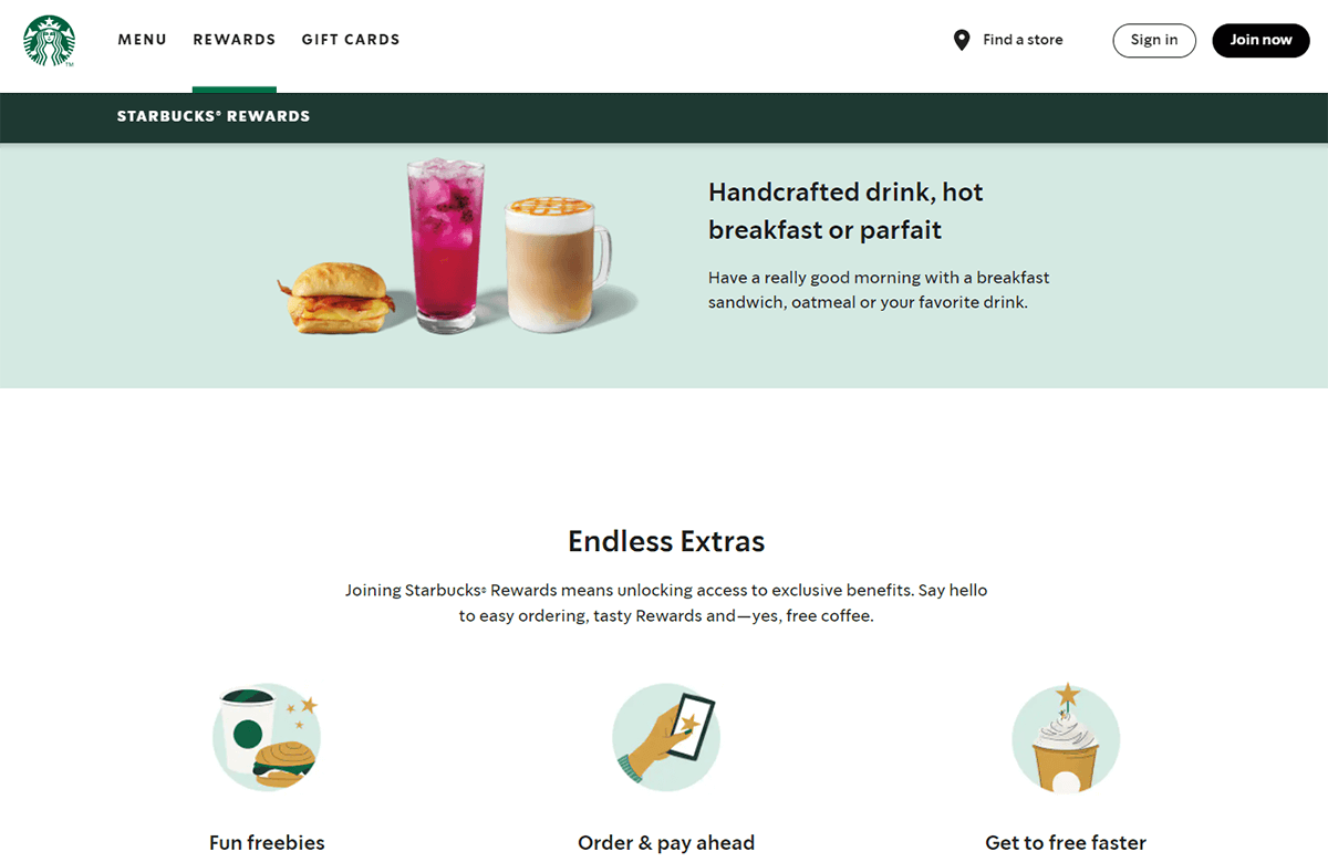
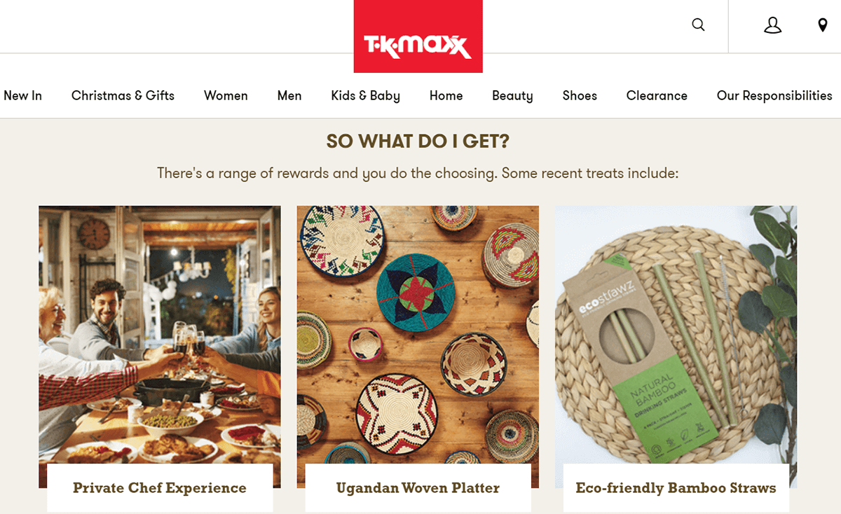
Loyalty program highlight
Starbucks really makes the most out of the earn & burn formula with its loyalty program: customers earn Stars for each $1 spent at their local coffee shop, which then can be redeemed in five different reward categories, including a Starbucks-branded cup.
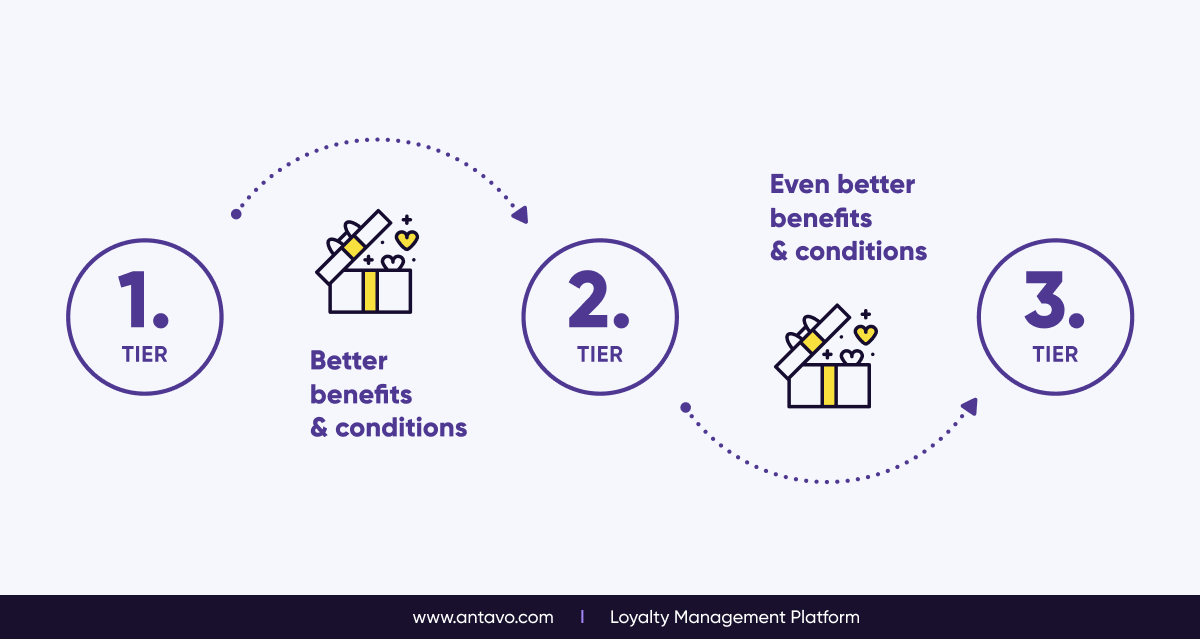
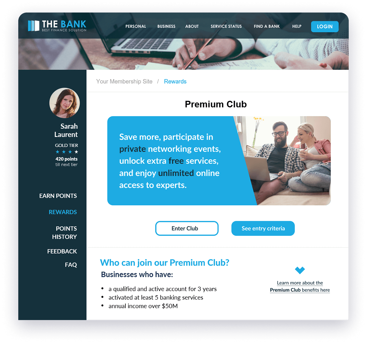
2. Tiered Programs – Progress & Benefit
With a tier-based loyalty program, customers gain access to incremental benefits and rewards by advancing through the ranks. Tiered programs encourage customers to spend and engage more in order to reach the next tier level or, in the case of tier expiration, to maintain their existing privileges.
Benefits
- Added value to status: Because each tier level is associated with different benefits, the higher the tier, the more exclusive the brand experience is.
- More targeted experiences: Segment your customer base more effectively with tiers. Doing so improves the experience and provides a basis for targeted communication.
- Establishing a long-lasting relationship: Tier-based programs keep customers engaged for longer, because reaching a new tier feels like an achievement and motivates the customer to continue ranking up.
- Behavioral science in action: Maintaining tier levels is just as important and desirable for customers as reaching higher ranks. Therefore, in programs where tiers expire due to inactivity, customers will keep spending to prevent losing valued privileges.
- Customers shielded from the competition: Due to the high time commitment associated with reaching the highest tier, customers are less likely to switch to another brand’s program because they won’t want to start over.
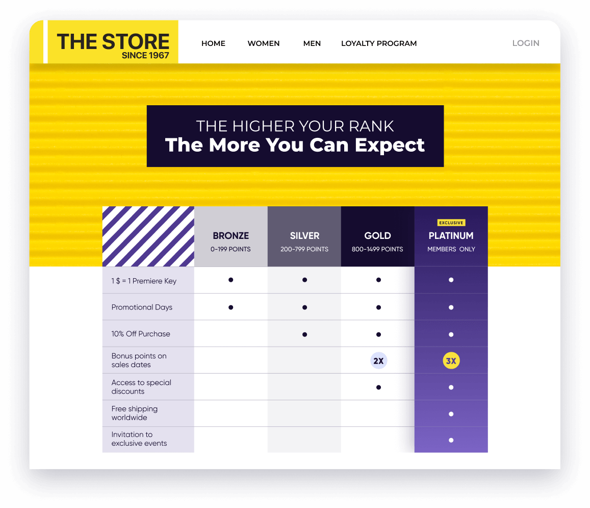
Loyalty program highlight
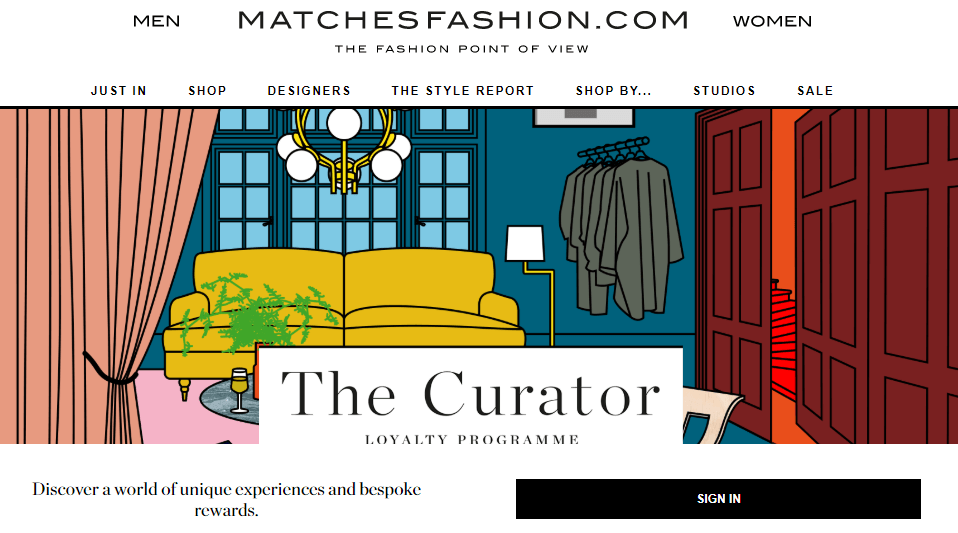
A modern luxury shopping destination, MATCHESFASHION, needed a loyalty program that could meet the company’s high standards. The program features four tiers and customers reach new ranks by keeping their spend high. Not only does the quality of rewards increase with each tier, but the quantity of benefits and exclusive services available also increases.
3. Perks – Join & Enjoy
A loyalty program based on perks grants benefits and rewards to all members unconditionally, regardless of how much they spent. The goal here is to generate an emotional attachment with the brand, which leads to recurring purchases. This approach also boosts enrollment rates.
Benefits
- Support brand building: Associating your brand with an accessible reward experience is highly likely to drive additional customer acquisition and promote brand awareness.
- Generate a sense of gratitude: Since benefits are granted unconditionally, members feel indebted — rather than entitled — to the privileges on offer. This helps to establish an emotional connection.
- Easy to manage: Running a perks program isn’t difficult: there’s no liability due to the absence of points, and you’re free from commitments since there are no achievable statuses.
- High value for actual cost: Exclusive services and transaction-related privileges are seen as desirable by customers, even though they come at a relatively low cost for companies in most cases.
- Highlight services unique to your brand: If your business is characterized by exclusive services that are hard to replicate, it’s a great idea to put them in the spotlight with the help of a perks program.
Loyalty program highlight
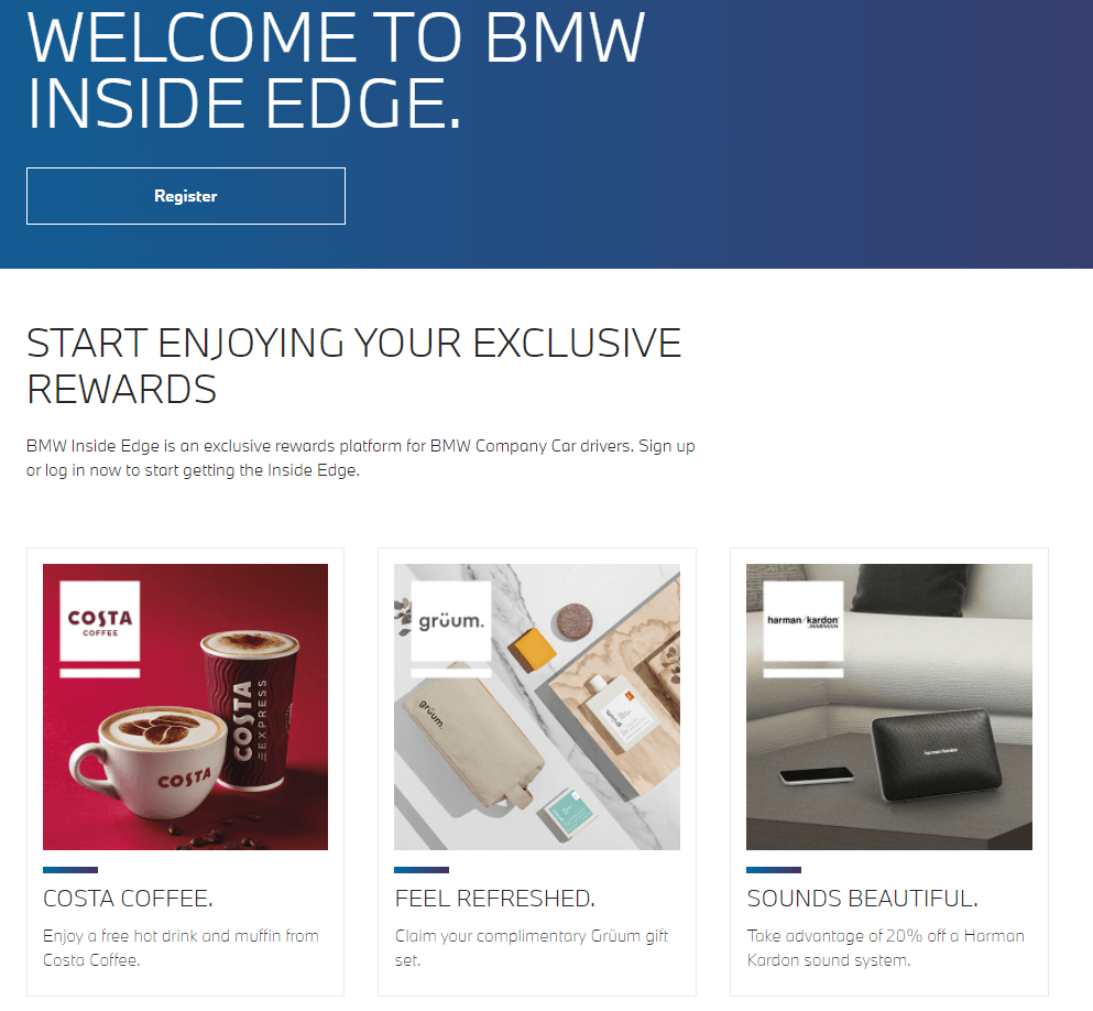
BMW UK offers an exclusive, perks-driven reward experience for company car drivers. Inside Edge – empowered by Antavo – gives members unrestricted access to perks such as free coffee and muffins at Costa Coffee, discounts on BMW services, free movie rentals, special learning courses, and many more.
4. Gamified Programs – Play & Unlock
This type of loyalty program is based on -challenges or badge collecting to engage customers in a gamified way. The goal is to encourage members to interact regularly with touchpoints and repeat key behaviors so that they don’t lose their privileges.
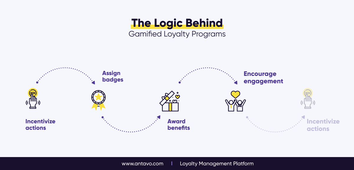
Benefits
- Shape customer behavior: Ensure each challenge has an end reward that can be claimed by performing a series of actions, or by reaching new milestones.
- Boost spend through badges: Create badges based on the number of purchases or on total lifetime spend, so that members who wish to earn a badge and the associated reward need to be more active buyers.
- Popularize non-transactional touchpoints: Valuable actions such as completing surveys, writing product reviews or downloading the mobile app can be popularized by including them in a challenge.
- A truly gamified experience: Badges and challenges offer a more exciting and visually enticing way to engage with customers, and helps you to gamify the loyalty experience.
- A safe choice to launch with: Gamified loyalty program offerings can start out small, and then be expanded. Explore how customers respond to gamified activities and act on the insight.
Loyalty program highlight
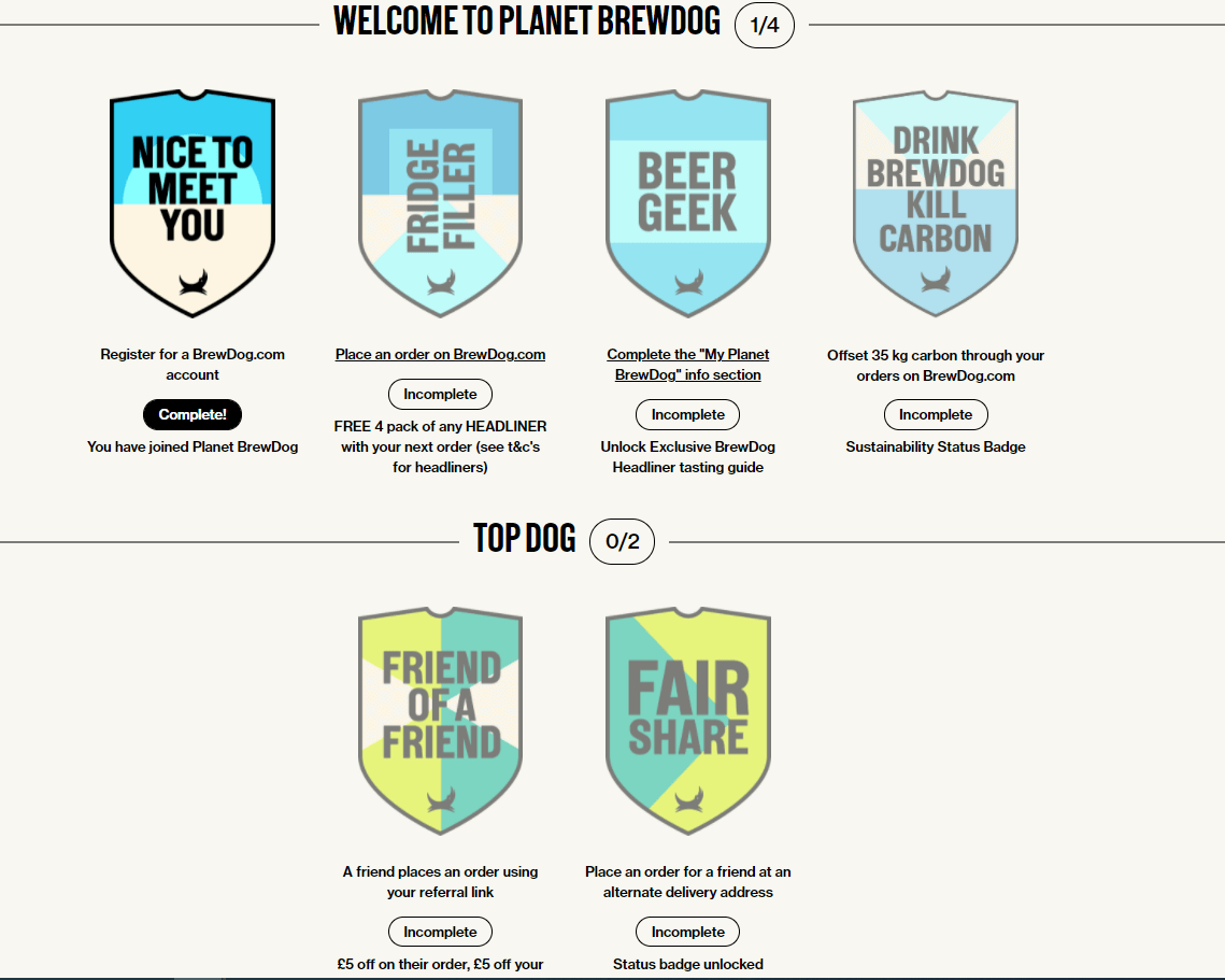
Planet BrewDog is the loyalty program at craft beer brewing company BrewDog. BrewDog wanted a simple yet intuitive loyalty program that aligned with the brand’s mission of offsetting the CO2 output. As a result, Planet BrewDog doesn’t use points. Instead, members can earn badges and unlock instant rewards for various actions.
5. Loyalty Communities – Target & Retain
Communities are smaller clubs within the loyalty program. They are based on specific topics, interests or values that are important to your customers. As a result, these clubs are a great tool to help you strengthen your relationship with members.
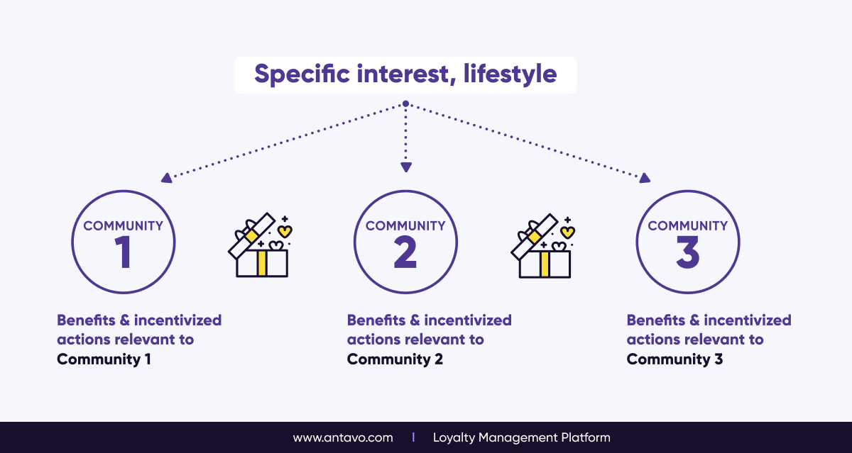
Benefits
- Add an unlimited number of communities: Provide each of your customer segments with an experience that goes beyond transactions, setting you apart from the competition.
- Connect with customers via their interests: Communities can be centered around a popular product, such as a gaming console; a lifestyle or hobby; or even ethical values, like sustainability.
- Support brand building: Build a like-minded community around your brand by attracting customers with specific interests. Community membership can be free or tied to access criteria.
- Highly personalized experience: By targeting a smaller audience with a common interest, you’ll get to know these customers better and be able to provide targeted offers that truly resonate.
- Reinforced program structure: Communities aren’t standalone loyalty programs, but instead serve as an exciting and engaging add-on to another loyalty program type, such as Earn & Burn.
Loyalty program highlight
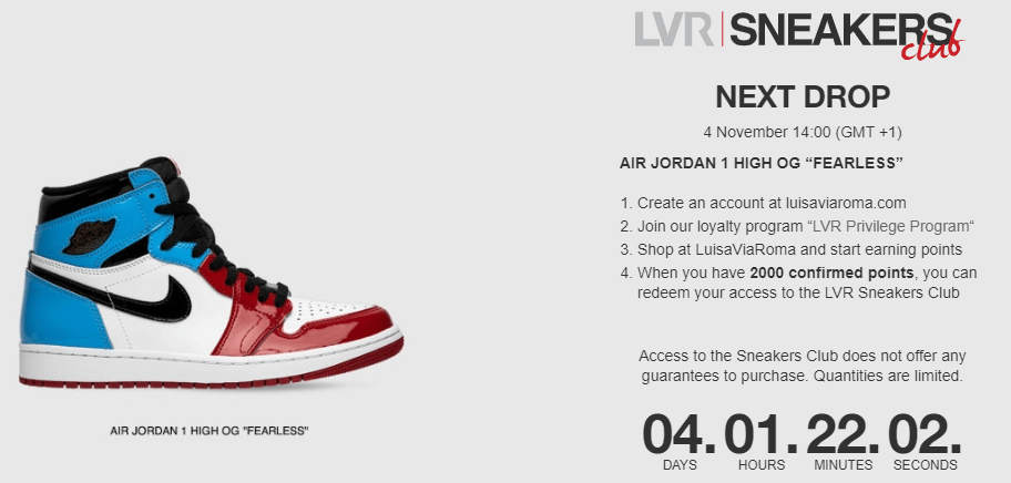
Italian luxury fashion retailer LuisaViaRoma has a loyalty program centered around exclusivity, called LVR Privilege. There’s a VIP club within the loyalty program called Sneakers Club. After paying 1,000 points to enter the club, members receive early access to upcoming sneaker drops for a whole year.
6. Lifestyle Loyalty Programs – Recognize & Engage
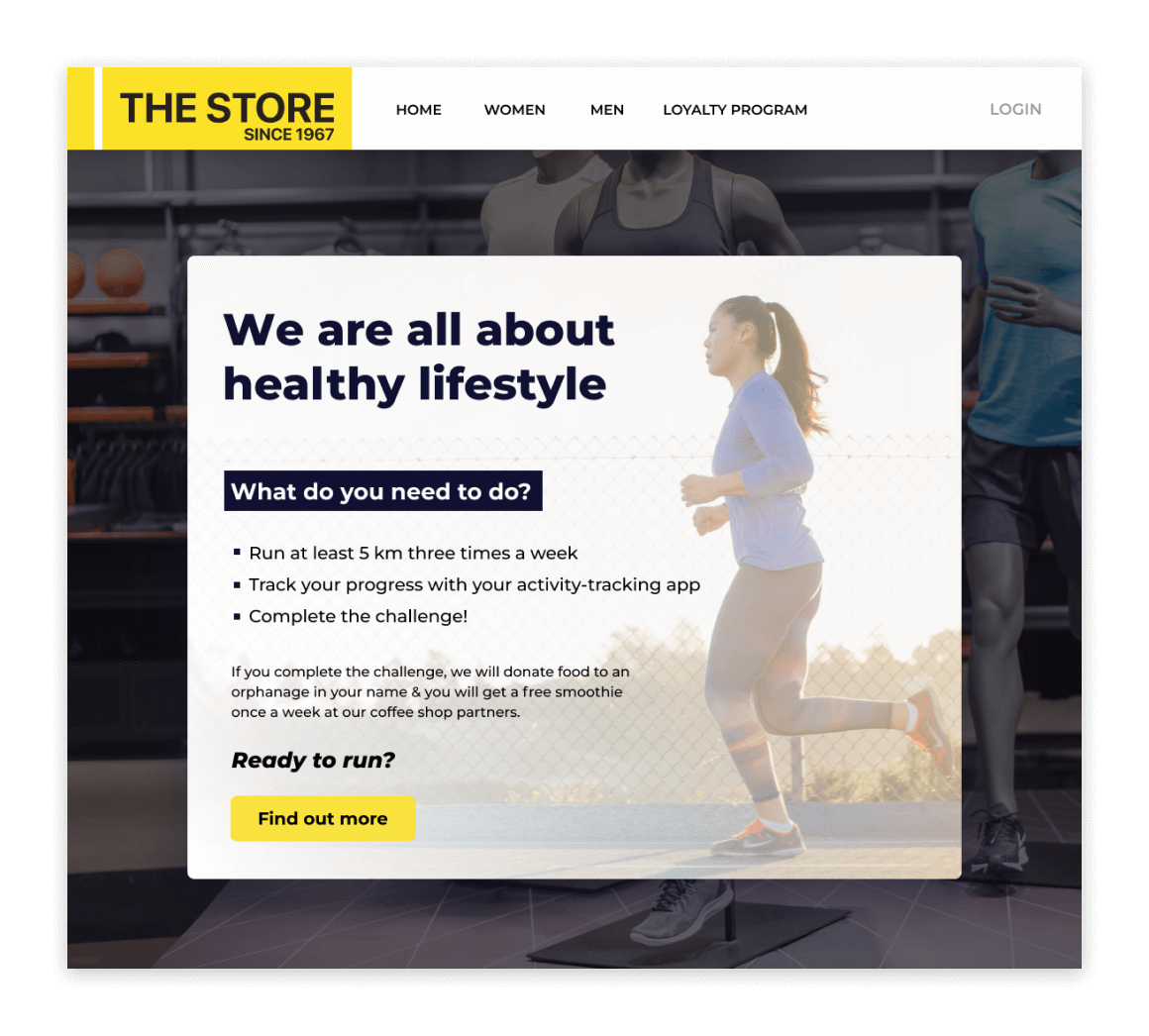
Encourage valuable behavior and establish long-lasting brand love by rewarding customers for living actively or caring for the environment. Connect your brand to your target audience’s ideals, values and aspirations.
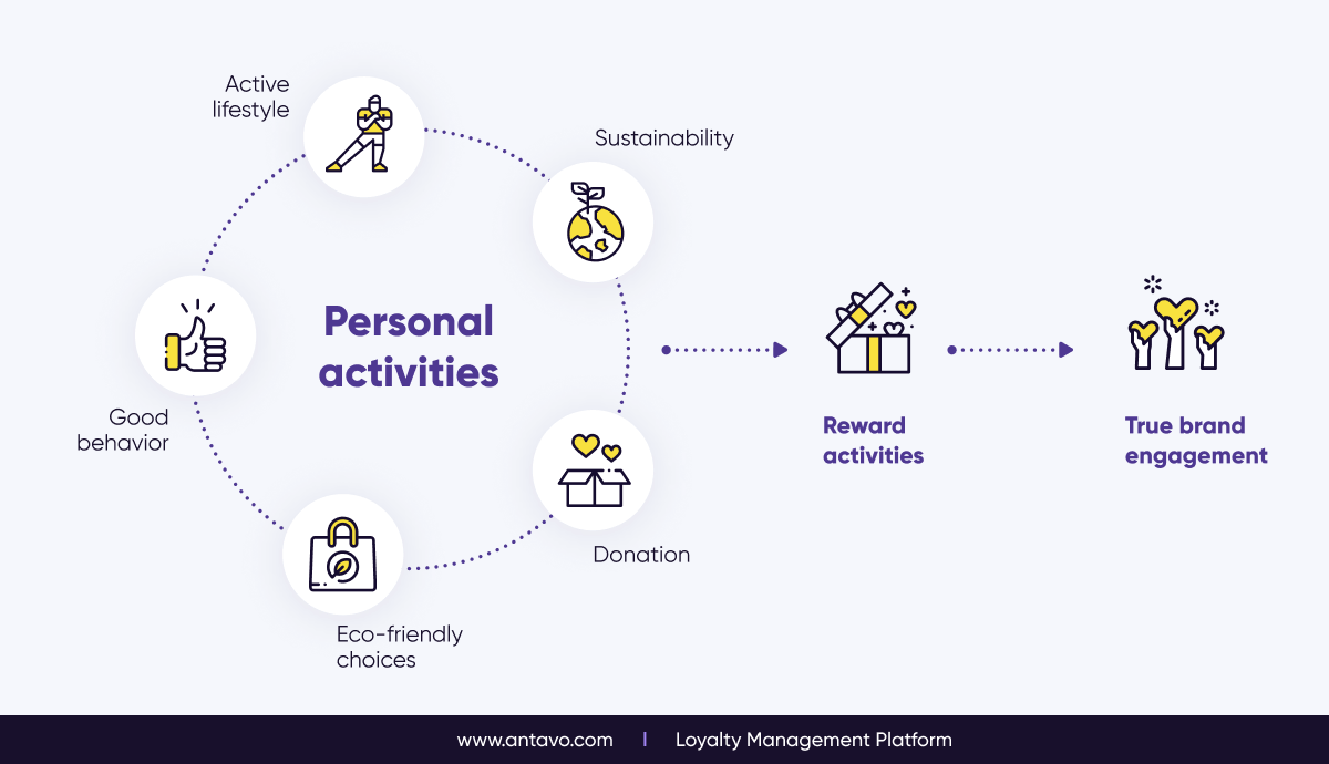
Benefits
- Engage customers outside of the buying cycle: Move beyond rewarding transactions and offer customers experiential rewards. Acknowledge members for non-purchase interactions such as recycling or working out.
- Bolster your brand image: Take a more active stance on social and environmental issues. Customers feel better about spending money when they know your company is doing good.
- Reward positive lifestyle choices: By integrating a tracking app into your loyalty program, customers can immediately receive points for completing fitness or other activities.
- Share the same values: Align with your customers’ beliefs and aspirations. This is crucial for companies today, especially when their target audience includes Millennials and Gen Z.
- Building advocacy through lifestyle: Being part of your customers’ everyday lives is a great opportunity to reward them for living well and to show them that you truly care.
Loyalty program highlight
Surfwear company Rip Curl has created a loyalty program that recognizes customers for doing what they love the most: surfing. Thanks to an integrated sports tracker, members can earn points for being outdoor, riding waves. This helps the company forge a strong emotional bond with their customers.
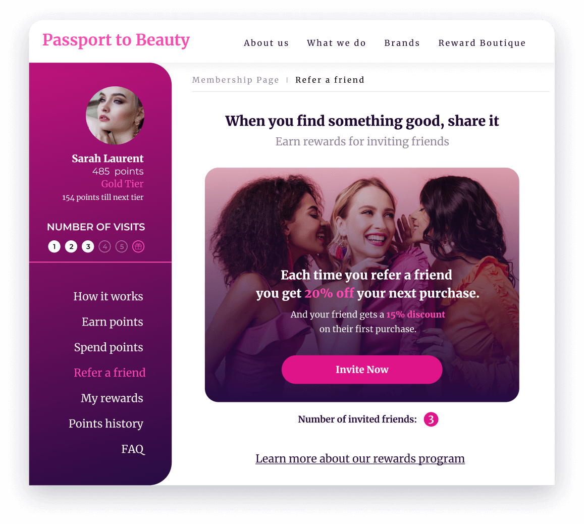
7. Influencer or Referral Loyalty Programs – Invite & Impress
People trust recommendations from their family, friends, and credible influencers more than they trust advertisements. That’s why a referral program is one of the most effective ways to attract customers.

Benefits
- Leverage word-of-mouth: Customers are the best promoters of your products. People are more likely to purchase a product when it is recommended by close friends and family or an authentic influencer.
- Create relevant relationships: Reward customers for inviting like-minded shoppers to buy from your store. Show how much you value their contributions and let them know that they are a key part of your success.
- Easily track influencer activity: Each influencer receives a unique link, seamlessly integrated for sharing. These links provide companies with insight into who they should reward.
- Build credibility: Credible influencers usually have a large, engaged audience that brands can tap into to build their reputation and drive sales.
- Expand your network: When working with new influencers, you might connect with new audiences. Create more meaningful and niche marketing initiatives, and build customer relationships.
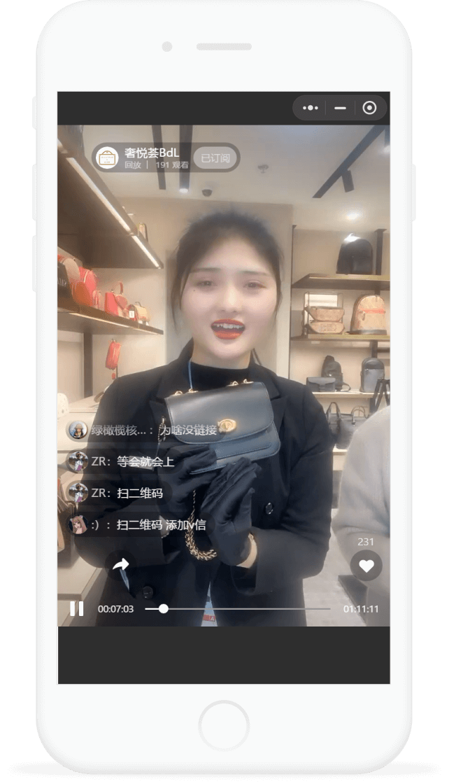
Loyalty program highlight
For the China-based Lagardère Travel Retail, social media integration with WeChat played a critical role in the loyalty program concept. It allows members to enroll, earn points and, most importantly, participate in live streams right on the social media platform.
8. Paid Loyalty Programs – Exalt & Differentiate
In paid loyalty programs, members pay a recurring fee to receive great benefits they can use right away. This is an attractive way to both acquire new customers and establish a stronger relationship with current customers.
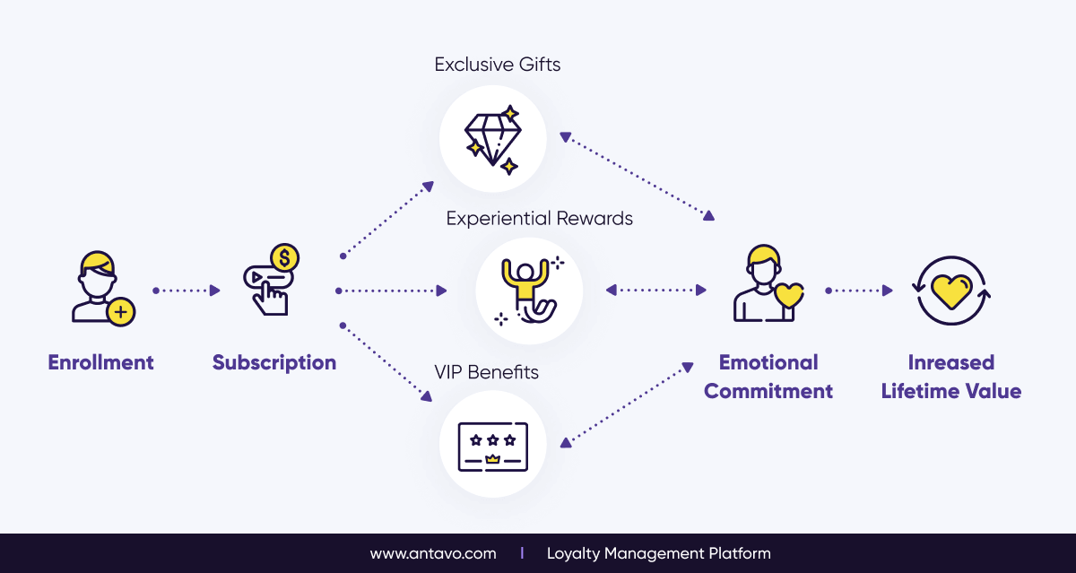
Benefits
- Identify your most loyal customers: With an up-front payment, these exclusive programs attract high-quality customers. Only those who are truly dedicated to your brand are willing to pay for premium privileges.
- Connect at an emotional level: Being recognized connects customers and your brand on an emotional level. Once members have paid the fee, they will want to enjoy the advantages of being a part of the paid program.
- Drive a higher ROI: Higher purchase frequency, basket size, and brand affinity are all ensured by a paid loyalty program. The initial investment that members make fund these programs.
- Obtain quality customer data: The data you’ll receive about shopping habits and personal interests can be used to personalize the member experience.
- Keep customers engaged for the long run: Members will be more committed and engage more regularly with your brand, promoting a lower dropout rate.
Loyalty program highlight
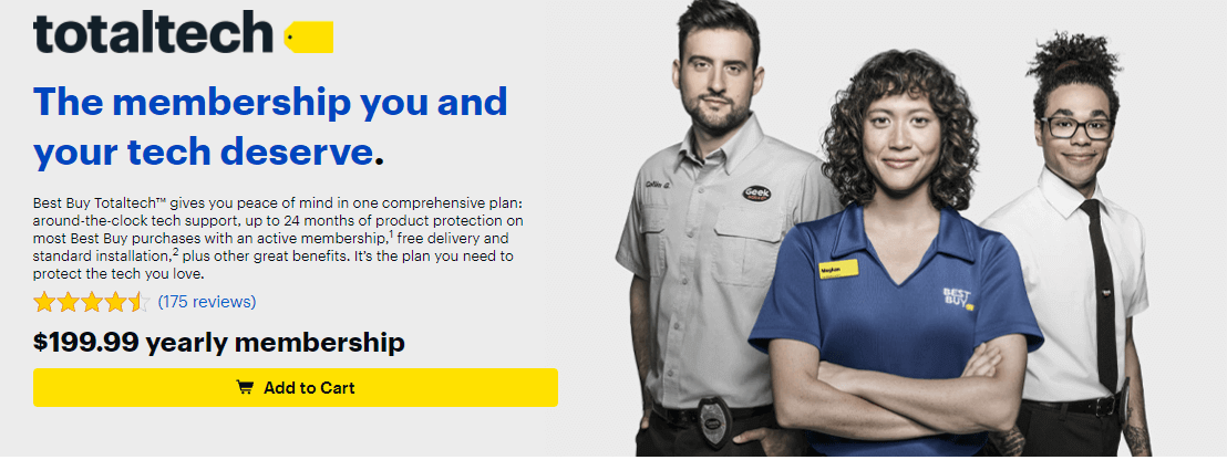
Membership for Best Buy’s Totaltech loyalty program costs $199.99 a year. In exchange, members receive unlimited, round-the-clock tech support, members-only prices on merchandise, free 2-day shipping and installation on all orders, as well as VIP access to dedicated phone and chat teams.
9. Coalition Loyalty Programs – Connect & Unify
Coalition loyalty programs unite multiple brands under the same roof. Ideal for shopping malls, department stores, airports and retail hubs, these programs increase footfall while also encouraging customers to enroll using various technology solutions.
Benefits
- Increase footfall and repeat purchases: Create a thrilling shopping environment where customers can earn points at any store, and then redeem their point for rewards during the same visit.
- In-store customer identification: Choose from a wide range of technologies and integrations to create a holistic customer journey, where shoppers can be seamlessly identified and rewarded.
- Add value through joint tenant offers: Tenants can upload offers and campaigns directly to the loyalty platform, which you can monitor and review.
- Gamified customer engagement: Run co-branded social media contests, organize in-store treasure hunts, introduce a multi-brand referral system and encourage user reviews.
- Easy and unified enrollment at all tenants: Boost the number of loyalty program members quickly and effortlessly by integrating receipt scanning, cloud printing, card linking or other innovative technologies.
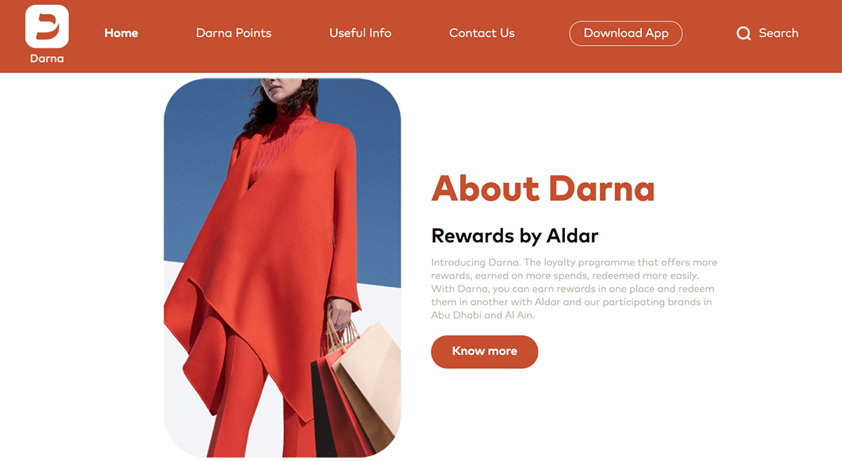
Loyalty program highlight
Launched in September 2020, Darna Rewards is a coalition loyalty program in the UAE region. It allows customers to earn points and enjoy a wide range of benefits in a network of dining, gym & spa, theme parks & golf facilities, and retail establishments.
10. Hybrid loyalty programs
A hybrid loyalty program merges two or more types of programs together, because mixing multiple elements is often the key to adapting a loyalty scheme that fits your business strategy.
Benefits
- Select the best from each program type: Bypass the limitations of any individual type of loyalty program and reach your full potential. Start with functionalities from one type of loyalty program, and mix things up later on by adding exciting new elements.
- Move the most important KPIs: Each program type helps to move KPIs in its own way. With a mixed program, you can easily drive non-commercial goals, such as supporting your brand positioning.
- Cater to your target audience: Reach your audience more effectively by optimizing your loyalty program over time. Introduce elements from various loyalty program structures that resonate with your customers.
- Connect with your customers’ values: Make a lasting impact by introducing features that support your brand’s message. Reward sustainability or an active lifestyle to connect with customers who share your brand’s values.
- Flexibility from the start: Play around with various elements from different program types and see what works. You don’t need to commit yourself to one idea alone – you can always introduce something new.
Loyalty program highlight
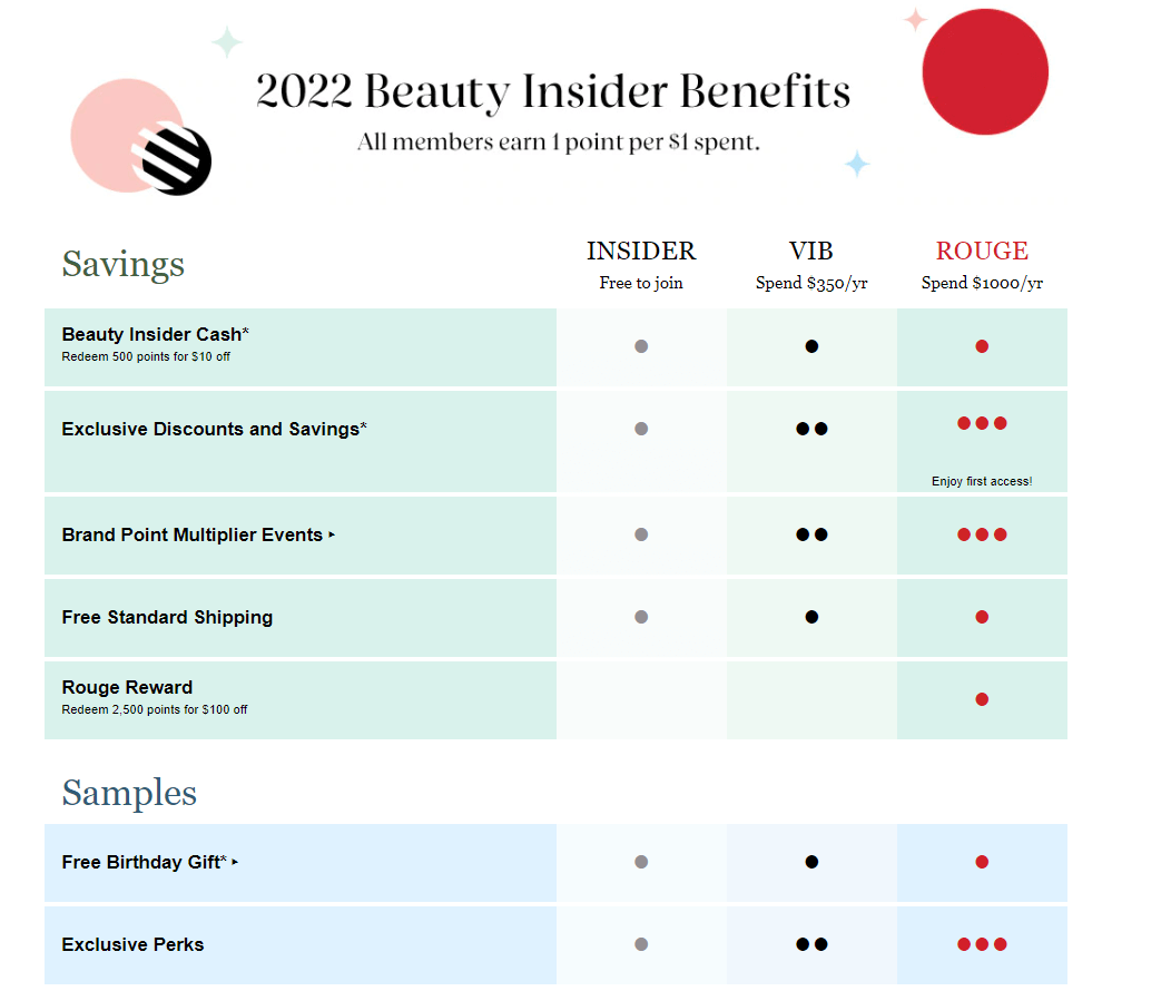
Sephora’s Beauty Insider program is a prime example of how to create an exciting loyalty program that offers something for everyone: it has three reward-packed tiers, offers the ability to turn loyalty points into coupons, and includes additional benefits, many of which are truly experiential.
Key Takeaways & Actionable Insights
- When it comes to designing your loyalty program’s core logic, there are so many options to choose from other than point earn & burn
- Tiers are a fan-favorite among customers and have lots of potential for long-term engagement
- Perks are ideal for boosting enrollment rates and fostering gratitude among members
- The core loyalty program type can be boosted through gamification, community building, influencer marketing and lifestyle elements
- For malls, department stores, retail locations or brands with large partner networks, coalition loyalty programs are an optimal fit
- You can always mix and match elements from different loyalty program types to create a hybrid-style program
Step #3: Creating the Reward Catalog
Now that you have an idea how your loyalty program looks, it’s time to talk about rewards. The kind of incentives your reward program will offer should be clarified rather early on, because rewards have a strong impact on the budget, as well as on the technical requirements for implementation. So make sure to plan out what kind of rewards you want to make available for the launch, and also consider what rewards should be added on later on.
What Kind of Rewards Should You Offer?
In short, rewards are benefits or physical items that are granted, gifted, or assigned to loyalty program members based on their achievements or efforts within the program. When designing your rewards catalog, choosing the most fitting incentives for your brand and target audience is equally as crucial as picking the right goals and objectives you would like to achieve with your loyalty program.
There are 5 types of rewards you should consider:
1. Financial benefits
Financial benefits are either percentage-based or fixed-amount discounts. They are a hygiene factor: customers generally expect some form of monetary benefit, but these alone won’t make people more loyal to your brand. Still, coupons (especially as a welcome reward) are effective for boosting member acquisition, and these types of rewards are easy to implement.
2. Events & experiences
Events & experiences really allow you to use your creativity. The category can include things such as concert tickets, free lunches, party invitations, and hotel stays. These are great opportunities to grant customers lifetime memories, which can lead to lifetime brand love and advocacy. On the other hand, the more exclusive the reward, the less attainable it should be, so you can maintain the exclusivity factor. Plus, organizing events is no easy task.
3. Physical gifts
Gifts are a type of product or hand-crafted item that customers receive, either from your inventory or from a partner’s. Gifts are perceived as more valuable and desirable than a simple coupon. According to Gartner, product experience (the customer’s journey involving the product) has the biggest impact on customer loyalty, which accounts for over 36% change in customer loyalty, respectively. Gifts are also great mystery rewards if you wish to surprise members. However, be mindful that some gifts require manufacturing or prolonged acquisition.
4. Service-related benefits
Service-related benefits have the goal of making the shopping experience more convenient from a customer’s perspective. These could be, for example, express shipping, money-back guarantees, or free alterations. Service-related benefits tend to generate positive word-of-mouth, but only if they have NOT been available before in your loyalty program. Moving privileges like free alterations from an accessible, low tier to a higher tier may cause backlash.
5. Custom rewards
Custom rewards represent any kind of reward that does not fit into one of the aforementioned categories. Custom rewards are the perfect opportunity to get creative: come up with something unique and brand-specific which can distinguish your business from the rest. Use your customer insight, creativity, and resources to devise something unique.
For more insider knowledge about designing an appealing reward system for your loyalty program, download our ebook.

Deciding the Right Price for the Rewards
The price-point value is the number of points (and their real-life money equivalent) required in order to claim a particular reward. It’s a pivotal part of any customer loyalty program: make the price too high, and it will turn customers away. Make the price too low, and it will bite into your profit margin.
The exchange rate is defined by three factors:
- The actual cost of the reward (objective value)
- The availability of the reward (objective value)
- Perceived value (subjective value)
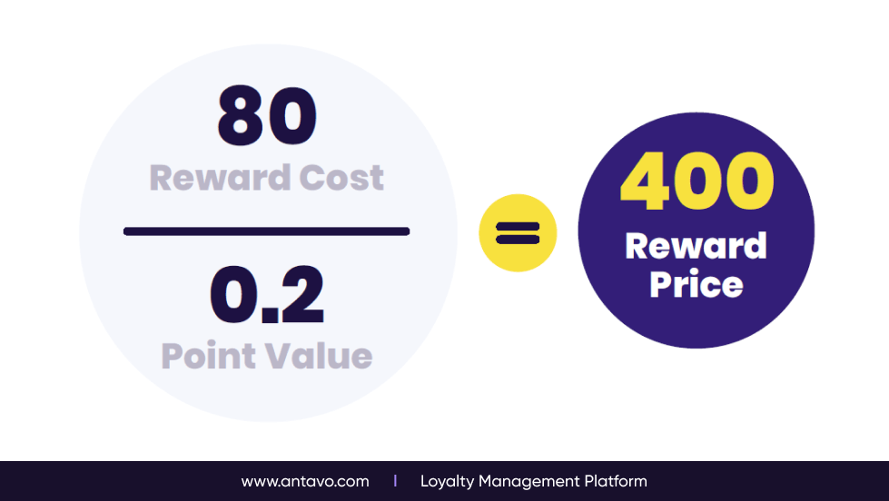
For example, let’s assume that in your loyalty program 1 point is worth $0.2. Loyalty points can be redeemed for a gift reward that costs you $80 in total (including shipping). To calculate the point price for this reward, take the price of the incentive and divide it by the fixed exchange rate of loyalty points. In this case, it means that the pricetag for the gift should be around 400 points.
Being flexible is half the battle
Of course, other factors can influence the outcome. If the previously-mentioned gift is designed or signed by one of your brand influencers, then their fans are most likely willing to pay double the price just to get their hands on it. But if you have a warehouse of trinkets you wish to clear out by handing them out as loyalty program rewards, then lowering the cost will entice bargain-hunting members to jump on the opportunity. The best course of action is to test the waters with a test group. See how long it takes for customers to reach the rewards, and adjust the values accordingly.
Remember: it’s always better to start strict, and loosen the rules later on, than go the other way around. Raising the price of a reward after launch may anger customers, but lowering it shows goodwill. Also, the first reward should always be at arm’s length for new members (like a welcome reward), but add a condition that activating it requires at least a single purchase, in order to protect your profit margin.
Managing the Accessibility of Loyalty Rewards
It’s worth mentioning that price isn’t the only thing that affects the desirability of a reward. Creating scarcity may potentially boost the value of an incentive, but not giving away all rewards at the beginning is also vital if you wish to engage with customers for a long time.
Here are your options for limiting the rewards in your catalog:
- No limitation: Think of any discount or coupon, with a set value.
- Time limitation: A classical FOMO tactic, where customers need to redeem their reward within a specific time period.
- Quantity limitation: If the available stock is limited, people automatically see the reward as valuable. Plus, customers race against each other because only the early birds will get the worm.
- Limitation by status: You can also segment your audience based on relevancy and spend value, for example, giving your top spenders exclusive access to certain rewards.
Let’s Not Forget About the Logistics
Deciding how to deliver the rewards to customers should be the final item on your checklist. After all, logistics can be costly, so they should definitely be taken into account during the budget planning phase. Reward delivery is handled differently at each company, but here are the most common tactics:
- Delivered by a partner: If you choose some of the options listed in the previous section, the partner will take care of the delivery.
- Shipped to a company blacksite: The reward will be sent to one of your local stores, where customers can pick it up.
- Delivered with the next purchase: The customer will get their reward automatically with their next purchase. This keeps money in your pocket, but can be a bit disappointing for the buyer.
- Code redemption: The reward itself is a coupon code, which the customer can use during checkout.
- Direct download: If the reward is a leaflet or an event ticket, the customer can access it through a download link.
Key Takeaways & Actionable Insights
- Rewards can be categorized in a variety of ways, ranging from financial benefits to physical gifts, or even invitations to community events
- You should use a solid pattern to calculate the price of each of your reward
- Changing the accessibility of a reward can add an extra layer of FOMO or exclusivity to it
- Make sure to factor the logistics into your calculations
Step #4: Adding a Little Spice With Experiential Rewards, Gamification and Surprise & Delight Elements
The next step in creating a loyalty program is adding some features that make the experience truly shine. This is a topic that relies heavily on your creativity, because you need to come up with ideas that complement your brand image. Remember how Rip Curl used a sports tracker to reward surfing, thus creating a unique, on-brand reward journey? You need to do the same! Here are some great loyalty program ideas for inspiration.
Experiential & Lifestyle Rewards – Because Meaningful Engagement Matters
In a loyalty program that’s meant to be emotional and customer-centric, experiential and lifestyle rewards should be at the forefront of attention. In Antavo’s Global Customer Loyalty Report 2022, when current loyalty program owners were asked about their future plans, 65.2% of respondents not offering experiential rewards stated that they plan to introduce this feature within the next three years. As for respondents who plan to introduce a loyalty program in the next two years, 55.4% reported that their loyalty program will include experiential rewards.
The only thing that impresses modern customers, especially Gen Z buyers more than a memorable experience is when a brand aligns with their values. This can be done in a variety of ways, such as promoting charitable giving, rewarding sustainability, or incorporating lifestyle elements into the loyalty program.
The best experiential & lifestyle rewards for customer loyalty programs
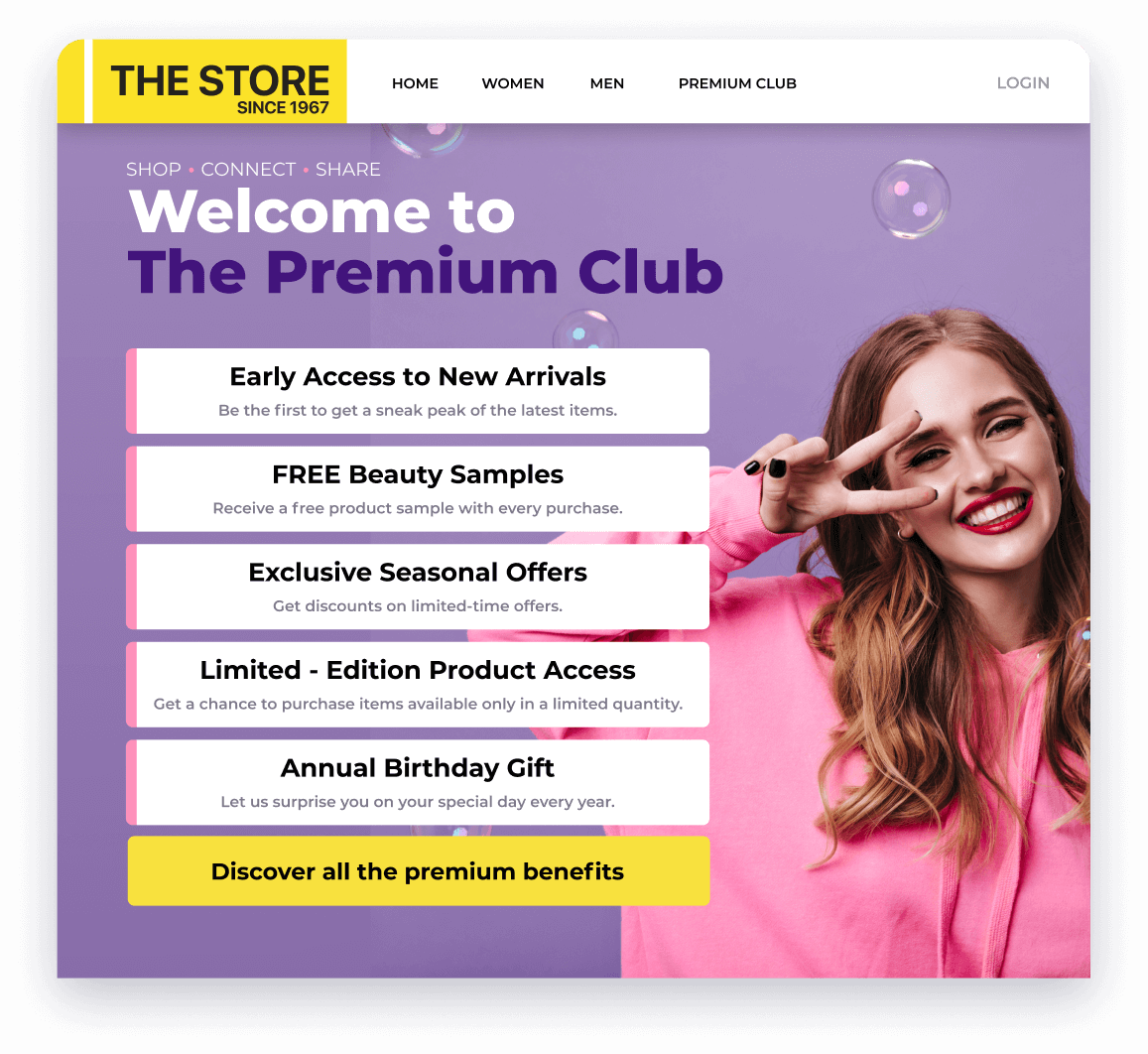
- Early access – Early access to upcoming sales events or product drops is an excellent reward. For one, it makes loyalty program members feel privileged because they have access to something that other people do not. But early access also helps you save money, because managing it in the loyalty program platform has little to no associated cost.
- Enhanced customer service – One of the leading causes of dissatisfaction among customers is not receiving adequate and polite help in times of need. Avoid this by providing your most valuable buyers with a VIP customer service line, which clearly shows that you care about them.
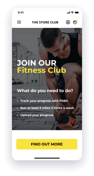
- Lifestyle-driven rewards – Instead of reserving certain rewards for a high tier, use them to reward specific activities. For instance, make limited-time merch available only to those who bring back used clothes for recycling, or to those who use an integrated sports app to complete a workout challenge.
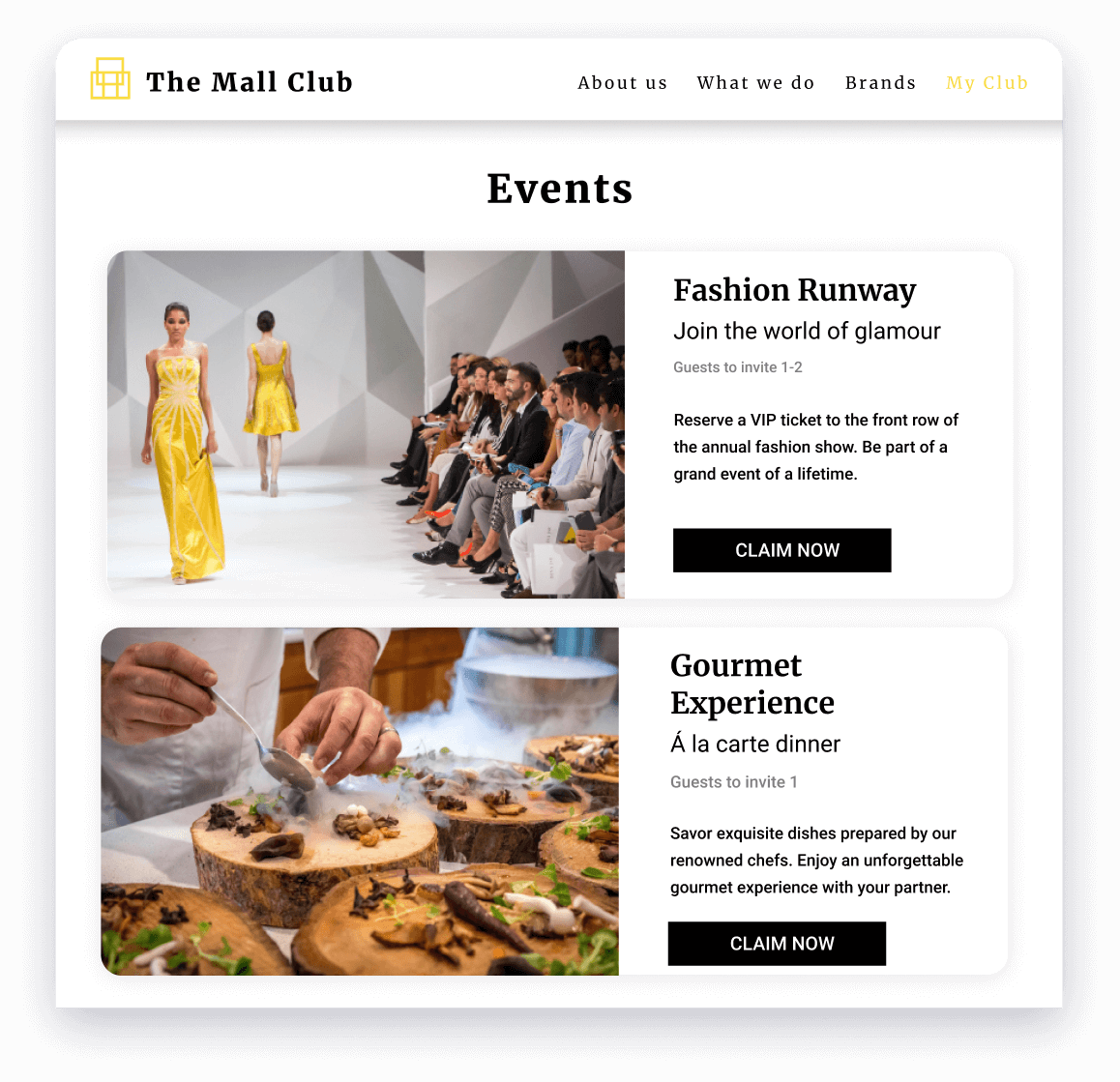
- Members-only events – Organizing an exclusive, members-only gathering to celebrate your brand’s birthday is the perfect opportunity to foster a like minded community, give participants the time of their lives, and identify potential brand advocates and influencers who can be nurtured later on.
- High-end partner rewards – Harness the power of partnership and add exquisite rewards to your catalog, such as concert or movie tickets, branded merch, or an all-inclusive meal at a fancy restaurant. Partner rewards make your list of rewards more alluring, and for a relatively low cost.
- Community input – Nothing makes customers fall in love with their favorite brands more than the opportunity to leave their mark on the brand’s history. Being given the opportunity to provide feedback or ideas about future products, or getting invited to try out the loyalty program before the official launch, will create memories that last.
Gamification – Let the Fun Begin
Game-like elements and mechanics in a non-game context is the definition that best describes gamified loyalty programs. The gamification market itself is looking at a bright future, predicted to reach $27.7 billion in market size around 2026. And, as the market grows, new opportunities and technologies will emerge, allowing loyalty program owners to make their system even more fun and engaging.
Keep in mind that you can use gamification elements in any rewards program, no matter what structure you choose. Just make sure to pick a type of gamification that matches your brand image, and creates a fun and exciting experience for members.
The best gamification features for customer loyalty programs
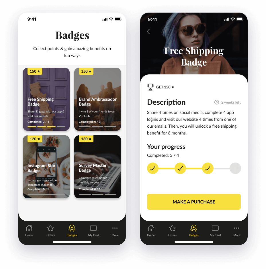
- Badges & challenges – Badges and challenges are popular gamification elements that create the feeling of accomplishment, while strengthening the customer’s connection with the brand. Because being honored is something we all love, badges are one of the most effective tools for building habits.
- Social media interactions – Nowadays, social media is in every corner of our lives. Customers love exchanging experiences and sharing ideas with each other, so why not harness the power of word-of-mouth? Turn your customers into brand advocates by rewarding them in a hashtag contest on Instagram.
- Online & offline treasure hunts – Treasure hunts make customers feel like kids again as they search for specific items on your website or in-store. The aim here is to help customers familiarize themselves with parts of the (e)store that they might have overlooked. They help you promote product and store discovery in a subtle yet entertaining way.
- Leaderboards – Leaderboards can be a great way to motivate users to interact with your program more often. Whether you are tracking their progress on collecting badges or playing with a built-in minigame, they are an effective way to get users to engage with each other, helping companies build communities.
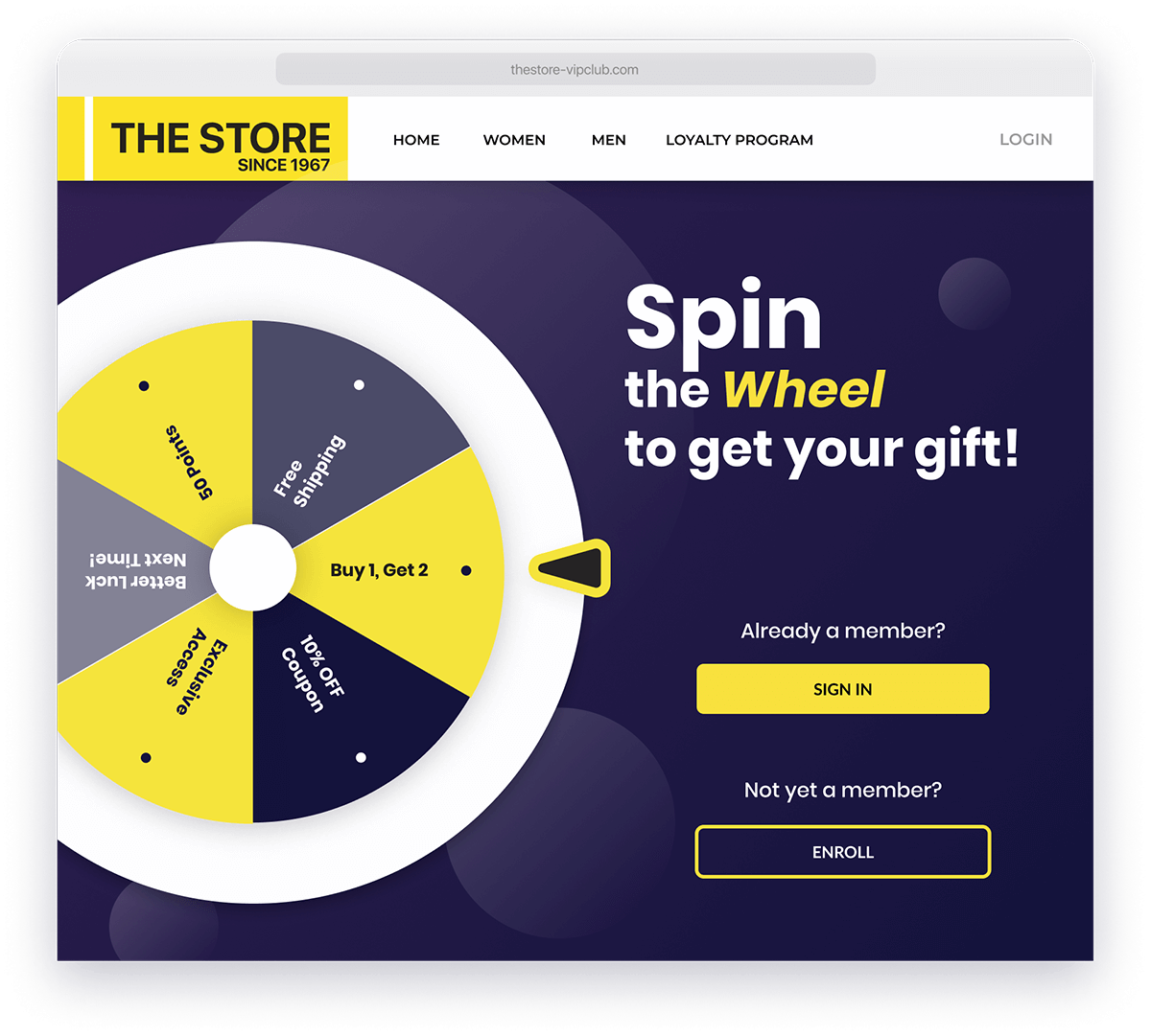
- Prize Wheel – Everyone loves the sight of a spinning wheel, especially when it lands on a tile with a nice prize. Prize Wheels immediately get customers’ attention and are a fun, engaging way to build anticipation. They are also a great eye candy to boost enrollment rates — especially on mobile devices.
Surprise & Delight – Make Your Customer’s Jaw Drop
By adding surprise and delight mechanisms to your retention strategy, you can create special occasions in shoppers’ lives and experience a boom in purchase frequency and customer engagement. After experiencing a pleasant surprise or mystery reward, shoppers will not only be more inclined to start repeating valuable actions in hopes of receiving more benefits, but they will remember your business fondly as well.
Surprise and delight can be used to play on customers’ desire for excitement, recognition and individuality. Receiving an unexpected gift or perk from a business not only has the potential to make a customer’s day, it also has the potential to turn them into a lifelong, loyal, brand advocate.
The best surprise & delight features for customer loyalty programs
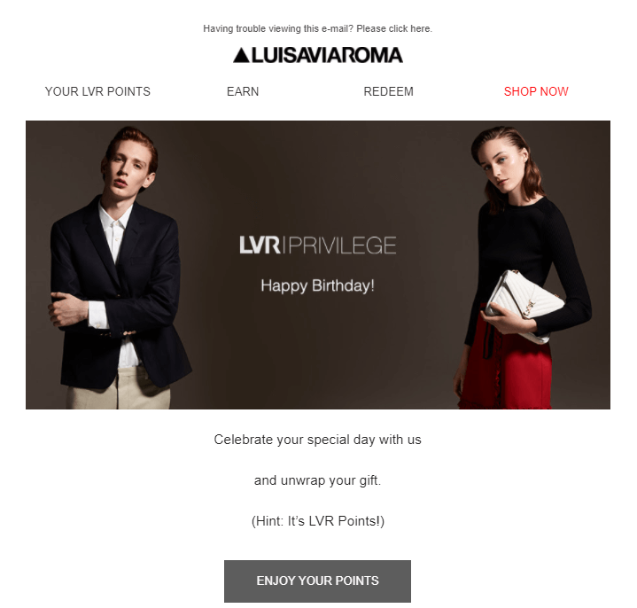
- Birthday surprises – If you know a customer’s date of birth, then you have the perfect opportunity to surprise them with an unexpected offer, discount or reward. Thoughtful gestures like this make customers feel appreciated and will increase their lifetime value.
- Surprise rewards – Offer members random rewards, like free cupcakes, during their next store visit, or consider sneaking a product sample into the package of their next online order. Samples have the added benefit of giving customers a chance to try something they haven’t yet. If they love the sample you sent, they might even purchase the full-size product later on.
- Mystery gifts – The concept of mystery gifts is simple: give customers a bit of excitement and awaken their curiosity by offering a secret surprise. Customers won’t know what they‘ll receive until it arrives at their door. This approach makes it more likely that members will create a buzz about it on social media, helping you engage a larger audience.
- Secret tiers – Offer a secret tier to your most valuable customers, in addition to the publicly displayed tiers in your loyalty program communications. The aim is to grant privileged treatment to your most valuable customers. This is especially beneficial for luxury-oriented brands.
- Free shipping days – Offer top-tier members free shipping for a limited time. Notify them via email and watch engagement and purchases skyrocket during the offer. By limiting the offer to specific tiers, you can ensure this benefit continues to feel exclusive to your top customers.
Key Takeaways & Actionable Insights
- A loyalty program needs more than just points and rewards: it requires unique mechanics and features to truly stand out
- Gamification is a great way to make the experience more fun and build certain habits among members
- Experiential rewards don’t have to be expensive, but they should, however, reflect your brand’s values and style
- Surprise & delight is all about timing: if you wish to give a reward, make sure to do it when members least expect it!
Step #5: Building a Framework for your Data Collection Ecosystem
Data is the lifeblood of any business. However, recent privacy laws and the crackdown on third-party cookies has forced companies to re-evaluate their data strategy. As a result, attention has turned towards zero- and first-party data, as well as the technology and solutions that help brands capitalize on them.
What role do customer loyalty programs play in this, you may ask? Well, reward programs benefit businesses on two fronts: they help organizations collect zero-party data through incentivized surveys, while also delivering valuable first-party data about shopping habits, reward preferences, and so on.
Making Surveys a Fun Activity
Zero-party data is the type of data collected via surveys, questionnaires, feedback forms, customer profiles, and other methods. Unfortunately, customers generally skip these, either because they dislike the idea of sharing their information, or just don’t know how it will be used.
This attitude can be changed by putting a reward on the line. According to Accenture, 54% of shoppers are open to sharing personal information and shopping preferences with retailers in order to receive personalized offers. So the solution is simple: offer customers bonus points, personalized offers and other benefits, in exchange for filling out your surveys.
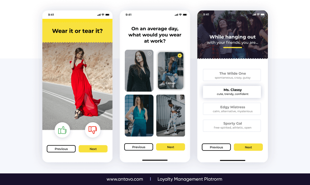
But take a step beyond typical old survey formats. Customers still want fun and excitement — even when they are filling out incentivized surveys. Instead of asking a list of bland questions, use gamified surveys to present your questions in a more engaging way, using visuals, sliders, and a more personal tone.

It’s important to realize that loyalty programs are a tremendous source of zero-party and first-party data. So those businesses that are really leaning into their direct marketing strategy through digital channels recognize that, in the context of these data privacy changes that we’ve seen, they’re able to really gather very good data from their customers relative to what they’re responding to, and so forth, through loyalty programs. And it’s a great way to create a very strong data foundation with your existing customers.
Gamified survey formats
- Like/dislike questions: Here, members can express their opinion about a topic or question by tapping on thumbs-up or thumbs-down icons. This format also immerses customers in the quiz, so they are likely to answer dozens of questions without noticing the amount of time they’ve spent doing so.
- Image option: Loyalty program members tend to engage more with content that features images, as it helps them visualize the subject. Learn more about your customers’ preferences by showcasing a curated selection of images.
- Free text: Offering several choices is better than asking members to come up with an answer on their own. This approach also makes customers aware of the choices they have. Still, make sure the answers are presented in a quirky manner to keep up the interest of participants.
Adding a Touch of Relevance Through First-Party Data
Besides incentivizing surveys, loyalty programs also provide more touchpoints and a greater amount of first-party data to collect, then leverage. For instance, if a customer is in a mid-level tier of your loyalty program, you know they are a loyal, returning customer. Also, if a customer is at risk of churning, you can look up their coupon history to know whether a low-value coupon will be enough to reactivate them.
This rich layer of loyalty data can be infused with your marketing activities in a number of ways. Here are a few examples:
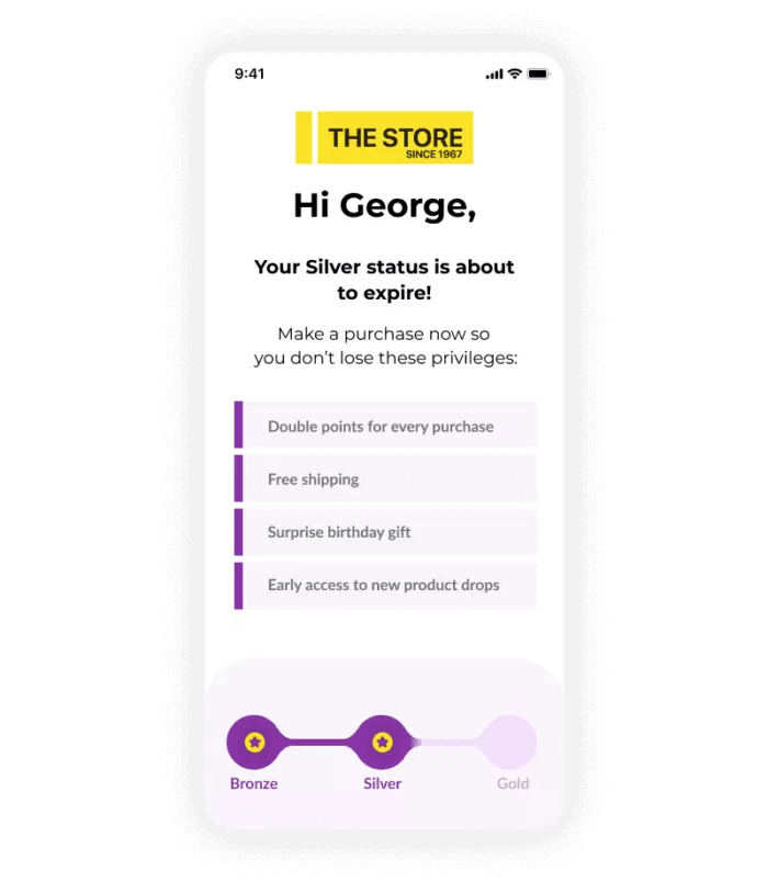
- Surprise & delight birthday emails, where the reward is determined by the customer’s tier or overall purchase volume
- Reminder emails for customers who are close to reaching a new tier, recommending that they make a purchase to move up
- Friendly notification emails when a customer’s points or tier membership are about to expire
- Monthly summaries of the progress members have made
Loyalty Programs Are Just One Piece of the Personalization Puzzle
In order to put the data you’ve collected into good use and fully personalize the loyalty experience, you need to integrate with a best-in-class technology provider or two. When it comes down to it, there are three providers in particular who provide invaluable service when it comes to personalization:
- Marketing automation providers
- Customer data platforms
- Loyalty programs
All three have their main area of focus:
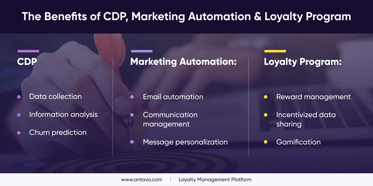
There’s no jack-of-all-trades provider if you are looking for quality
The question is: can a loyalty program substitute the other two? On a technical level, yes (to a degree), but it’s not recommended. Some customer loyalty programs may offer built-in churn prediction capabilities, or have the ability to trigger loyalty emails for a couple of hundred high-target members.
Nevertheless, these features don’t measure up to the sophistication and ease of use provided by a CDP or marketing automation platform. Of course, this is true the other way around, too — just because a marketing platform has earn & burn or referral capabilities, they won’t be enough to build an innovative and unique loyalty program.
Achieving personalization through synergy
Instead of trying to go solo, you should look into ways how to incorporate the loyalty program, marketing automation and CDP together. For example, loyalty programs incentivize survey completion, which can then be fed to the CDP’s algorithms. Or surprise & delight birthday emails can be enhanced with a gift, such as bonus loyalty points or a discount on the customer’s favorite product category.
Using a combination of tools is also the most convenient development-wise. Just make sure that the loyalty technology you have chosen comes with a huge network of integrations, because developing integrations alongside the implementation process may cause unforeseen delays.
Key Takeaways & Actionable Insights
- Loyalty programs are a tremendous source of zero-party data because you can use the reward system to cost-effectively incentivize survey completion
- Gamified surveys come in many shapes and sizes, but their main objective is to make data collection fun and easy for members
- Loyalty programs also generate plenty of useful first-party data if you establish the right touchpoints and track the data carefully
- In order to use the data in a smart way, loyalty programs should be linked to other platforms, such as CDPs and marketing automation
Step #6: Going Omnichannel
Bear in mind that applying your customer loyalty program to only a single channel (be it offline or online) will limit its full potential. In this day and age, an omnichannel presence is expected from brands, as 60-70% of customers shop across channels, according to McKinsey. So make sure that the loyalty experience is consistent no matter whether the customer shops in your eCommerce store, your brick-and-mortar store, or browses your app while on the go.
Your Omnichannel Loyalty Checklist
In Antavo’s Global Customer Loyalty Report 2022, survey participants stated that offering a seamless omnichannel experience is one of their biggest challenges in the coming years. However, seamless omnichannel experiences have also been touted as one of the most influential loyalty program trends, meaning that even though it’s difficult, overcoming the challenge is well worth the effort.
Here’s a checklist to set you on the right path to omnichannel loyalty:
- Identify where your customers browse and shop the most. Focus on creating a smooth experience across those core channels first, then build from there.
- Map out your data. Where does your customer data come from and where does it live? What could you do better if it were unified?
- Consider your current offers and promotions. Are you making it easier for customers to engage on every channel where they want to shop?
- Understand how your customers enjoy spending their time. How can you reward them for it?
- Ask customers what causes they care about. Whatever the cause, it’s another opportunity to build real relationships.
Bridging the Gap Between Online, Offline and Mobile
A seamless omnichannel experience for your loyalty program is only possible through a single customer view — a unified account that holds all information about a customer, no matter on which channel they interact. For instance, craft beer manufacturers can keep tabs of a customer’s favorite drinks based on their online purchase history, and if the brand owns a bar, their bartenders can look up the patron’s profile to give them personalized beer recommendations on the spot.
This might seem easy, but very few organizations have access to a single customer view. According to a study by BCG, only 30% of companies have created a single customer view across channels. Luckily, if you’ve followed the steps of the previous chapter, you’re already building your loyalty program with data collection in mind, so now you just need the right technology to capture valuable data in a brick-and-mortar and mobile environment.
The Loyalty Card Dilemma: Plastic or Digital?
One decision you should definitely make early on is whether you wish to have traditional plastic loyalty cards, or digital cards that are stored on smartphones or displayed on the online membership page.
Surprisingly, plastic cards are still a fan favorite: according to the For Love or Money 2022 loyalty report, 49% of loyalty program members in Australia in 2022 still prefer to use traditional plastic cards, this has decreased from 81% in 2017. This interest is mainly driven by Gen Z and Gen Y customers. Though the survey only covers Australia, it’s safe to assume that many customers around the globe have a fondness for traditional loyalty cards.
However, one big advantage of digital loyalty cards over their physical counterparts is that they’re more likely to be within reach. 98% of Gen Z shoppers own a smartphone and it’s almost always on their person. Therefore it’s safe to say digital loyalty cards or coupons stored on the phone have a higher chance of being used and redeemed.
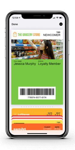
Mobile Passes
When it comes to digital passes, there is a smoother and more elegant way to present them, which doesn’t require customers to look for them in a browser or online membership page: Mobile Passes. Passes can be loyalty membership cards for a loyalty program, virtual coupons, tickets to special brand events, or even digital boarding passes for your next flight. Mobile Passes are stored in the smartphone’s mobile wallets, which is a native app on both iOS and Android smartphones.
Here’s how mobiles passes work:
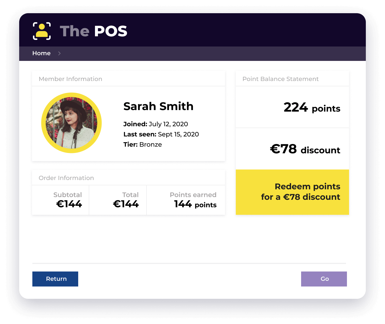
- When a customer’s mobile pass is scanned at the POS, they can redeem their points for various rewards and discounts. At the same time, retailers are able to identify in-store shoppers and learn more about their customers.
- Shop assistants can also use the system to enroll customers into the loyalty program and get instant benefits for future visits, such as a dedicated express checkout lane.
- Those who already have a digital loyalty card receive push notifications when near the store. These can be reminders or notifications about the latest sale.
Store Assistant Portal
In order to capture data about brick-and-mortar purchases and send them to the loyalty program’s database, you need specialized software and hardware solutions. A common strategy is to integrate with the POS system you use in your store, so you can scan each customer’s loyalty card (or credit card, if card-linking technology is enabled).
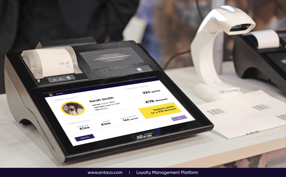
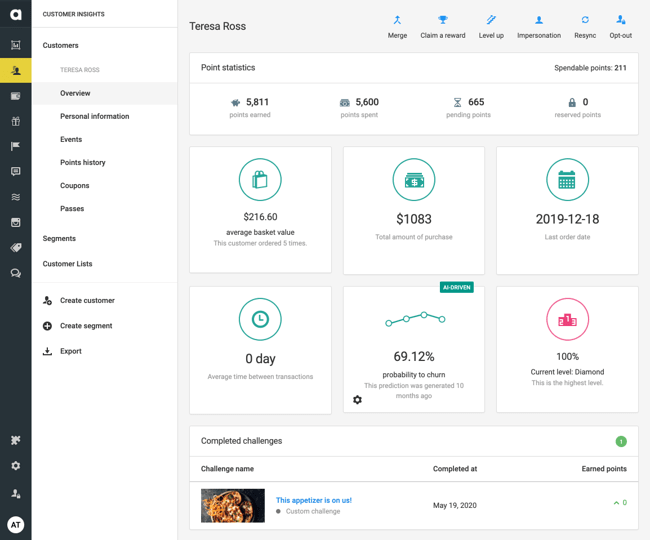
This is a great use case if you wish to enable in-store point collection, as well as identify brick-and-mortar customers. However, if you want to give members more in-store options, you need to look for more sophisticated solutions. Antavo has developed the Store Assistant Portal: a custom-build application that runs on an Android tablet, helping staff members to administer purchases, returns, and point management for their Antavo-empowered loyalty ecosystem.
How the Store Assistant Portal works
The Store Assistant Portal allows staff to smoothly and efficiently handle loyalty management tasks in the physical environment.
- After scanning the customer’s loyalty card with the tablet’s camera, the Store Assistant Portal guides staff members through the most essential management tasks, such as looking up purchases or arranging returns.
- After every transaction, the customer’s point balance is automatically updated.
- The Store Assistant Portal offers more options for reward management, including a point redemption capability, where shoppers can turn their points into discounts in custom increments.

Key Takeaways & Actionable Insights
- Going omnichannel is no longer an advantage, but rather a must
- The first step in becoming omnichannel is to establish a single customer view
- Plastic cards are slowly fading out, so make sure to cater to the smartphone-loving generation with mobile passes
- In order to identify and reward customers in your stores, you’ll need either a POS integration or a unique solution like Antavo’s Store Assistant Portal
- To not only connect with in-store customers but also tenant retailers, consider opting for a robust hardware solution
Step #7: Aligning Your Customer Loyalty Program With Industry Standards
What’s considered to be “standard” or “expected” varies by industry. For instance, 85% of retailers regard personalized offers as important to the customer experience, according to Loyalty360. On the other hand, fast food chains offer free meals when members hit a certain milestone, reaching a certain number of visits or specified purchase volume. Frequent flyer programs, on the other hand, are known for more service-related benefits, like waitlist priority, excess baggage allowance, access to VIP lounges, etc.
Knowing your must-have elements and understanding which features have untapped potential are key to standing out from the competition. Therefore, this section is dedicated to a brief overview of how loyalty programs are designed in certain industries and verticals.
eCommerce Loyalty Programs
Forrester predicts that online shopping will grow to 27% of overall retail sales by 2023. To get a slice of this pie, businesses focusing on digital shopping require a tailored solution. An eCommerce loyalty program is a customer retention tool geared toward keeping and engaging existing customers, so they will buy in higher quantities, shop more often, or interact with your brand more frequently. They also help eCommerce brands establish themselves against big names such as Amazon without competing solely on the basis of discounts.
Top Loyalty Features for eCommerce Rewards Programs
- Gamification
- Offer management
- Social media contests & raffles
- Gamified surveys
- Incentivized reviews
- Multi-currency & multi-language modules
Retail Loyalty Programs
A retail loyalty program is a type of reward program that’s built from the ground up to help brick-and-mortars survive in a high-stakes market environment, as well as help customers build a meaningful relationship with their favorite store. Loyalty programs are extremely popular in retail: according to research by Gartner, 71% of retail brands analyzed are adopting loyalty programs.
Top Loyalty Features for Retail Rewards Programs
- Tiered, subscription or hybrid program types
- Digital loyalty cards and mobile passes
- Proximity marketing
- Card-linked offers
- In-store treasure hunts
- Instagram contests

B2B Loyalty Programs
B2B loyalty programs (or B2B rewards programs) are customer retention solutions that differ greatly from their B2C counterparts. When it comes to rewarding client or customer interactions, they take into account larger deal sizes, more complex buying decisions, and place an emphasis on long-term relationship building.
Top Loyalty Features for B2B Rewards Programs
- Perks or tiered loyalty program types
- Partner or co-operative rewards
- Referral systems
- Coalition loyalty capabilities
- Gamified surveys

Fashion and Beauty Loyalty Programs
The fashion & beauty industries are multi-faceted markets with a number of distinct categories, such as fast fashion, luxury fashion, footwear & athleisure, cosmetics and jewelry, just to name a few. Still, these kinds of reward programs are easily recognizable for their focus on experiential rewards, community-building elements, and status-driven tiers and privileges.
Top Loyalty Features for Fashion and Beauty Rewards Programs
- Tiers or perks
- Early access to products and sales
- Social media contests
- VIP clubs
- Birthday surprises
- In-store community events
Food & Beverage and Grocery Store Loyalty Programs
Loyalty programs for food delivery companies, supermarket chains, and online beer retailers aim to build loyalty in a sector where customers have a high visit rate, but relatively low order value. As such, discounts and coupons are less viable and instead loyalty must be built through other means. For this reason, food & beverage and grocery store loyalty programs have to balance between low-value and high-value rewards.
Top Loyalty Features for Food & Beverage and Grocery Rewards Programs
- Earn & burn or subscription programs
- Digital loyalty passes
- Receipt scanning
- Badges & challenges
- Store-specific offers
- Friend referrals
Pharmacy and Drugstore Loyalty Programs
In a highly crowded market that gives customers plenty of options to fill their prescriptions and purchase health-related products drugstore and pharmacy loyalty programs aim to give buyers a reason to be faithful to a particular brand. They also need to balance two distinct customer groups: those who are price-sensitive and those who seek convenience.
Top Loyalty Features for Food & Beverage and Grocery Rewards Programs
- Earn & burn or lifestyle programs
- Community features
- Rewarding healthy lifestyle
- Survey & content consumption
- Loyalty app
Automotive Industry Loyalty Programs
Automotive loyalty programs are unique customer retention tools geared towards companies in the automotive industry, including but not limited to car manufacturers, third-party dealerships, car rental services and fuel retailers. Automotive loyalty programs can be tailored to drive individual KPIs, such as boosting personalization, raising brand awareness, increasing social media presence, and so on.
Top Loyalty Features for Automotive Industry Rewards Programs
- Tiered or subscription programs
- B2B loyalty programs
- Partner rewards
- Gamified data collection
- Connected car technology rewards

Financial Services & Telecommunication Loyalty Programs
Financial services and telecommunication loyalty programs have a lot of untapped potential on the market. Because customers don’t purchase products in a traditional sense, the way they are rewarded needs to be unique. These companies also tend to interact less frequently with customers, therefore every touchpoint must be unique and meaningful.
Top Loyalty Features for Financial Services & Telco Rewards Programs
- Account-based benefits
- Subscriptions or rewards for renewal
- Partner rewards
- Reward sharing
- Infotainment content & quizzes
- Sweepstakes
Mall and Department Store Loyalty Programs
Department store and mall loyalty programs are complex reward systems that are geared towards enhancing the retail location’s value proposition, using multi-brand promotions and rewards that feature local services. However, while mall loyalty programs have more options to create cross-brand journeys, department store loyalty programs tend to focus on premium treatment.
Top Loyalty Features for Department Store and Mall Rewards Programs
- Coalition loyalty programs
- Cross-brand reward journeys
- VIP clubs
- Tenant management
- In-store gamification
Key Takeaways & Actionable Insights
- The structure, reward types and overall feel of a loyalty program depends heavily on the industry the program is built for
- eCommerce programs have plenty of opportunities to make the online experience more fun and engaging
- Retail programs should focus on creating in-store touchpoints
- B2B loyalty programs are more methodical and focus on long-term engagement
Step #8: Choosing the Right Loyalty Technology
It’s time to leave the strategy side of your upcoming customer loyalty program behind and talk about the more technical aspects, such as loyalty technology. So this section is dedicated to better understanding what’s behind the hood of a loyalty program: what type of loyalty technologies are out there, how to ensure that the management process is user friendly, and what to keep in mind while preparing a loyalty program RFP.
The Three Types of Loyalty Tech
It goes without saying that the software behind your reward program should be top-notch, otherwise you won’t be able to incorporate more sophisticated features, like online treasure hunts or rewarding workout milestones through a sports tracker app. Generally, there are three options to choose from:
- Developing the technology in-house: In the case of a loyalty program, the DIY route not only takes a lot of money and manpower, but also forces your team to invest an enormous amount of time into investigating loyalty program trends, customer behaviors, and UX trends. You can come up with the most unique loyalty program idea but it could take months – or even years – to turn it into a reality. Unless you have a whole department of developers at hand who can focus solely on your loyalty program, this route would be quite an investment.
- Hiring an agency: If an agency has experience working in the loyalty field, then you’re already off to a good start. Agencies can help you create an alluring customized loyalty program, they’ll help you develop it from start to finish, and they can even manage all the marketing communication around it. There’s one caveat, though: this solution is sure to cost a lot of money.
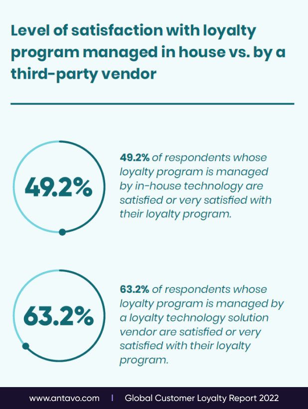
- Using technology from a third-party vendor: Third-party loyalty solutions represent the golden middle: they require active planning and co-operation on your behalf, yet the technology itself is readily available, so there is very little development needed in order to launch. This is especially true for pure-play loyalty technology providers, which offer sophisticated features such as gamification, multiple tiers, and gamified surveys. And because you are only paying for the technology, it’s more cost-effective then delegating the entire project to an agency.
Going No-IT With a No-Code Loyalty Platform
There’s no bigger frustration for a CRM or marketing professional than managing a platform that requires constant tinkering from the IT team. According to the Global Customer Loyalty Report, 76.2% of those who already offer — or plan to offer a loyalty program — want to equip their marketing team with the right tools and/or processes to reduce dependency on IT team. And going “no-code” is the most straightforward way to do so.
A no-code programming platform uses a visual development interface that enables non-technical users to create features by dragging and dropping software components, without the need for coding experience.
Using a no-code loyalty platform allows you to move faster and breathe easier while doing your job. With this approach, setting up a loyalty campaign or offer can be done without coding knowledge and without any support from the IT team. Using a no-code platform also comes with a lower maintenance cost, and has a lower implementation cost overall.
Writing an All-Encompassing RFP
An RFP, or request for proposal, is a type of business document that helps companies share the details about a project, in this case, the launch or revamp of a customer loyalty program. The primary goal of a loyalty program RFP is to solicit proposals from various vendors, which is highly recommended if you plan to work with a third-party vendor.
Deciding to issue an RFP means you have to pre-emptively do some research and come up with the concept for your loyalty program. But ultimately, this process leads to better results in the long run. RFPs facilitate a shorter vendor selection process, easier scoping, and minimize the chances you’ll go over budget. Just make sure to:
- Make the RFP — especially the goals, criteria and evaluation process — as detailed as possible
- Decide whether you are looking for: strategic support, a use case on how they would execute your concept, or proof that vendors have the capabilities required to deliver the expected outcome.
- Clearly state what kind of tech documentation and certifications you expect to receive, and make a distinction between the must-haves and the nice-to-haves.
Speed up your search for the perfect loyalty technology vendor with this comparison worksheet, which guides you through all the important aspects needed to evaluate vendor offerings.

Key Takeaways & Actionable Insights
- In order to ensure that your concept is realized without any compromise, you need to pick a loyalty technology that fits your needs
- You can develop the technology in-house, hire an agency to manage everything, or go with a third-party vendor
- Choose a technology that’s no-code, otherwise the day-to-day management risks becoming overly complicated
- One efficient way to ensure that the technology you choose will end up meeting your needs is to create an RFP that you can send out to agencies and vendors
Step #9: Preventing Loyalty Program Fraud
When planning and creating a loyalty program, it’s only natural to stay focused on the bigger picture, and set up the rules based on the way members generally behave. But let’s not forget that there are individuals who don’t play by the rules and instead seek to game the system or, even worse, commit fraud.
In recent years, loyalty program fraud has risen by 89%. This is due to the fact that loyalty points, coupons and rewards have real-life monetatary value which attracts fraudsters. So if members can find a way to claim a single coupon multiple times without losing it, or rack up loyalty points by spamming product views, they can actually cut into your margins.
Fraud in loyalty programs
- Hacking: Exploiting a security vulnerability to gain management control and stealing data or taking over customer accounts — these are the worst that could happen in any loyalty program. As such, you should treat cybersecurity as a top priority, and be sure to check the data protection capabilities of your third-party provider or agency if you aren’t developing the technology on your own.
- Employee fraud: Sometimes the greatest source of fraud can be found within your organization. For instance, employees who have access to the platform can misuse their privileges and hand out free points or rewards to their friends. Discovering internal fraud and identifying bad actors is often the hardest part, as employees may be able to use their knowledge and position to cover their tracks.
- Gaming the system: Though slightly less malicious than the other types of fraud listed here, users may exploit a bug or unforeseen loophole and cause significant financial harm as a result — especially if the loophole becomes public knowledge before it is fixed. Not to mention that punishing the culprits, who are still customers at the end of the day, may risk driving them away.
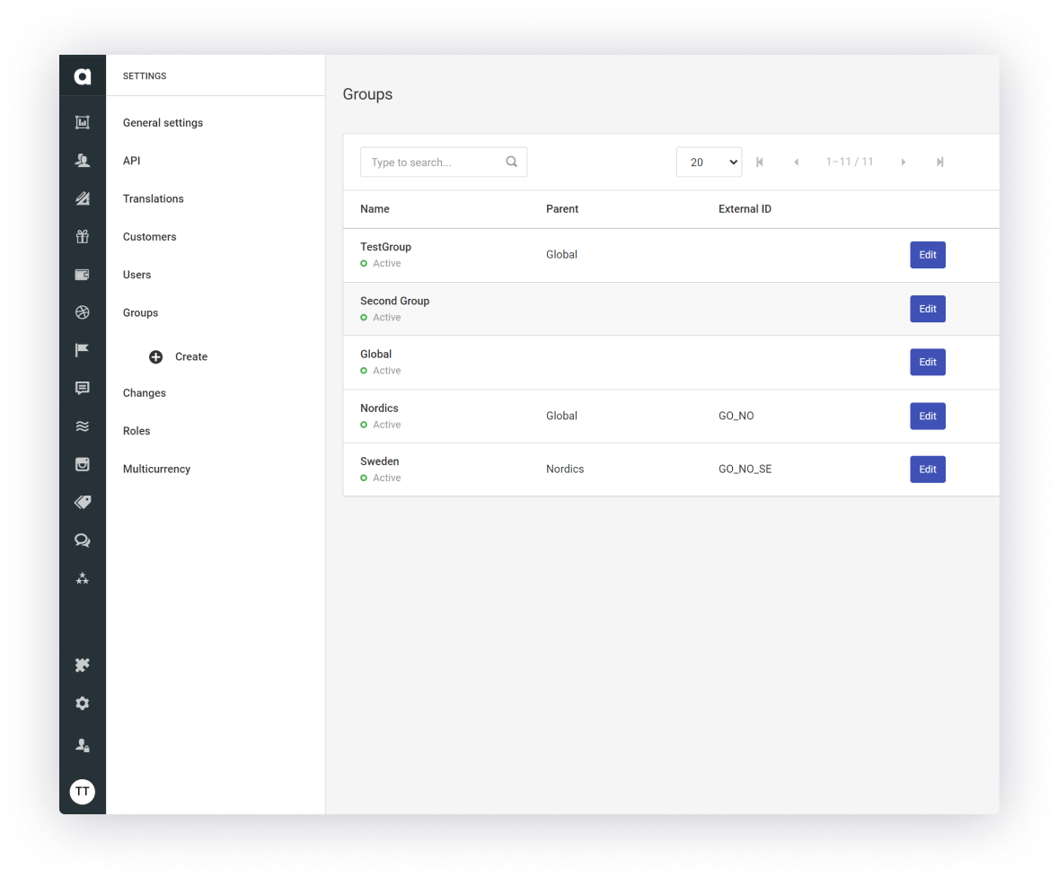
Deploying Preventive Measures Against Loyalty Program Fraud
Loyalty program exploits can take thousands of forms, and it’s easy to overlook them. Maybe your system allows members to change their date of birth (in case they got it wrong the first time). However, some savvy customers use this to make every month their birthday month, cashing in twelve birthday rewards a year. A single person who finds a loophole might fly under your radar, but if they post their discovery on a popular forum, others will start gaming the system, too. But if you wait until then to act, a lot of damage will already be done.
When it comes to preventing loyalty program fraud, your first line of defense should be your managers. Monitoring the program should involve more than just looking at enrollment numbers and counting the reward redemptions; they should be actively searching for irregularities and unusual patterns.
Loyalty fraud examples, and how to prevent them
- Customers create proxy accounts to capitalize on the welcome coupons: You can either limit the number of accounts per IP, or hand out the welcome reward after they have made their first full-fledged purchase.
- Employees hand out rewards to friends and family members: Introduce a cap on how many points can be earned with a single purchase. If a customer’s point balance is off the radar, it may mean they received points without making a purchase.
- Customers return products but keep the points: Add a pending period to the system so customers don’t receive their points until the redemption period is over.
- The reports show an influx of in-store purchases before or after closing time: This is another sign of employee fraud. Create an automation that automatically rejects points being added outside of opening hours.
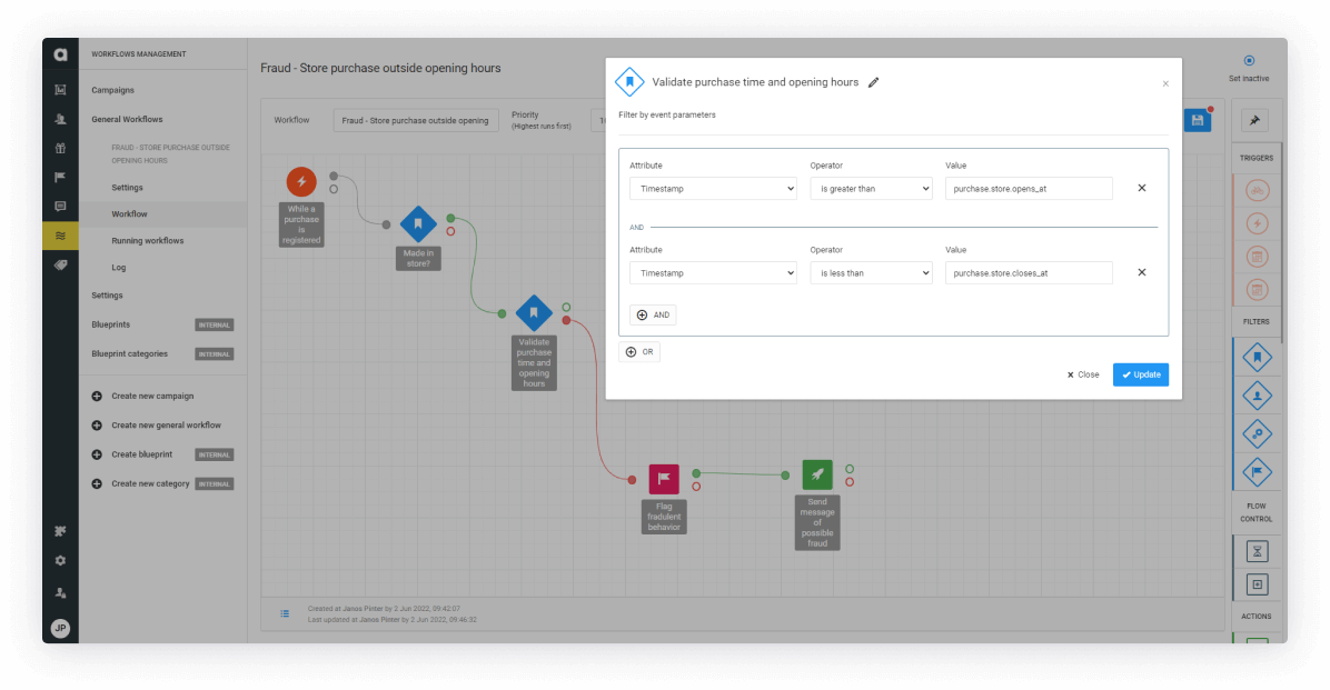
Key Takeaways & Actionable Insights
- Allowing loyalty program fraud to go undetected can put a serious dent in your bottom line
- Exploits can happen trough loopholes or undetected bugs, which customers may use without malicious intent
- Fraud can also be committed by employees, which can be much harder to detect
- Loyalty programs should be built with reporting and tracking in mind so you can put countermeasures in place
Step #10: Planning the Budget
Now we’ve come to one of the most critical questions for the whole process of creating your loyalty program: how much will it cost? Because no two loyalty programs are the same, it’s impossible to give a precise estimate. Also, some aspects may change during the implementation phase — features will be added or removed, rewards will evolve… In the end, the best thing we can do to help you prepare is a checklist and worksheet that will help you calculate loyalty-related costs.
Predictable Costs: Management, Marketing, Technology
While planning the budget for your loyalty program, you should start with items with prices that you can map out with relative certainty. Some examples are the salary of all of the employees dedicated to running the program, the cost of training in-store staff to handle and maintain the new technology, etc.
1. HR costs
This covers the total manpower working behind the loyalty program, including managerial tasks like creating and running reward campaigns, as well maintaining and analyzing the whole system. Regardless of your approach to developing the technology, it requires:
- A loyalty program manager
- A CMO, who instructs the loyalty program manager
- A marketing automation manager
- For occasional, high-priority marketing activities, such as a holiday reward campaign, you may also need to involve graphic designers, copywriters, or even a technical project manager
- If your program runs in physical stores, you will also need to involve your Head of Retail, an operational team, and train in-store staff

When we started off with the PRIVILEGE PROGRAM, I managed LuisaViaRoma’s CRM activities. As the loyalty program proved valuable, we were able to expand the team with a colleague who now manages the program, and another who is responsible for the marketing automation campaigns. My role has also evolved – today I am responsible for the team, managing all digital marketing
2. Marketing costs
The marketing budget should cover any form of advertisement, especially during the weeks before and after launch. Once the program is launched, spare no costs to promote the loyalty program on every channel. Ensure it is visible on your website, and make sure to promote it as part of your value offering through ads, social media, and videos.
3. Technology cost
The most straightforward of the three, technology costs represent all the money you spend on the loyalty program’s backend. If you choose to develop the program itself, this might become impossible to predict. If you choose to go with a pure-play loyalty technology provider like Antavo, you can count on a fixed or scalable recurring fee. On top of that, some of the following technology costs may also apply to your loyalty program’s budget:
- Licensing fee
- Implementation & integration fee
- Consulting fee
- Frontend development fee
- Employee training fee

Less-Predictable Costs: Rewards
Unlike the employee or the marketing budget, it is more difficult to give a precise estimate of how much your rewards will cost. Rewards also depend on customer feedback: unpopular or unused rewards should be subtly pulled from the rewards catalog, or be replaced with new ones.
1. Coupons and discounts
In terms of redemption, there are two types of coupons: redeemable coupons and automatically distributed coupons. When customers need to use their points to get a coupon, they’re basically ‘paying’ for it, which is more beneficial for your business. Discounts that are given to members as a welcome gift, a birthday reward or a tier-up bonus have a bigger usage rate and generate more interest, but are riskier simply because they come at a higher cost.
2. Early access
It’s a little known fact that early access is a golden opportunity among rewards: all you need to do is give a select number of customers the chance to purchase upcoming products before the general public. This not only comes at zero cost, but those who have this privilege tend to go out of their way to capitalize on this opportunity, thus increasing their lifetime value. Early access should always be a top-tier or VIP benefit, so other members will have the motivation to climb the ranks and experience early access for themselves.

3. Services
While planning your customer loyalty program, take into account the kinds of services you already offer. Making your extended warranty into a members-only benefit gives you a powerful incentive at no additional cost. While it can significantly boost your enrollment rates, it can lead to a backlash from the community, who might feel that you are taking away benefits away. A much safer approach is to lower the cost of certain services, e.g. express shipping, for those who sign up to the program.
4. Events
Events come in all shapes and sizes, ranging from in-store community gatherings to huge anniversary celebrations filled with influencers and special guests. Depending on the scale of the party, this can be quite a pricey reward, so make it sure it’s only done on special occasions. To prevent overspending, more lavish events like cocktail parties should come with an entry fee only your highest ranking members can afford, whereas movie nights or store openings can be made available to a larger audience.
5. Content
Using content as loyalty program rewards might come in the form of members-only blog posts or videos featuring tips and advice about a healthy lifestyle (or any topic you are an expert on). These are ideal entry-level incentives for tiered or perks programs that have the power to boost your enrollment rate. Content creation can either be outsourced or made in-house by your staff. Nevertheless, you can calculate the overall cost of the production based on how much content you wish to produce each year.
For more information about planning the loyalty program budget (including a list of best practices), download our ebook.

Key Takeaways & Actionable Insights
- While calculating the budget, there are two categories to keep an eye on: predictable and less-predictable costs
- Predictable costs include marketing expenses, the salary of the dedicated staff members, as well as the cost of licensing, developing and using loyalty technology
- Less-predictable costs revolve around rewards. The reason why they are less predictable is because the reward offerings are always in a constant flux
- For a successful loyalty program, make sure that the budget allows more than one type of rewards
Step #11: Preparing for the Implementation Process
The time has come. You have your concept and your budget. All you need to do is put the plan in motion, and carry out implementation. But do you know the exact flow of this process? If not, you risk setting unrealistic expectations and be forced to postpone the launch date due if certain integrations fall short or face delays. To avoid this, and to help you get a clear picture of how the creation of your customer loyalty program happens, we’ve laid out how the process should look in theory.
Please note that the following sections detail the implementation process when you partner with a third-party, pure-play technology vendor. If you seek to build your own technology or outsource it to an agency, the overall flow may change significantly.
Launching a Loyalty Program for the First Time
Building a loyalty program is quite a memorable journey. There’s a lot you can learn about it, but there are likely to be unexpected twists and turns that not even this guide can prepare you for. Therefore, it’s highly recommended to rely on advice from third-party experts, even if they may not align with your original vision, because they have more experience building loyalty programs.
1. Fail-proofing the concept
Writing a concept document is easy. Writing a concept document that can be turned into a solid scope is not so easy, especially if you have never done it before. At Antavo, our Business Analysts run through your concept and highlight gaps or edge cases to ensure that the scope is as fail proof as possible. The same applies to the technical aspects as well: if your other technology partners haven’t integrated with a loyalty program provider before, be sure to organize several meetings with the loyalty platform’s Solution Architect, where you can map out the to-dos together.
2. Realizing the scope
Now your loyalty provider will turn your realistic, feature-complete concept into a scope. The scope should include all the technical requirements, loyalty logic, customer journeys, and anything else that needs to be implemented. Think of it as a blueprint with all the action steps needed to actually bring your customer loyalty program to life. Once all the tasks have been delegated, you need a project manager who will oversee execution and ensure that all parties (including the loyalty technology provider, partner companies, and even your employees) keep up with their respective timelines.
An accurate schedule can only be provided once you have finished scoping, because all parties will need to provide their own estimate based on the final list of tasks on their plate.
3. Integrating and configuring the system
The next step is integration. The loyalty technology platform, like Antavo’s Enterprise Cloud, will be integrated with your system (as well as any third party CDP and marketing automation platforms) to ensure that data flows seamlessly between the systems.
In practice, it means that Antavo will receive the required data, such as purchase information, from you, run the loyalty logic to calculate how many points said purchase is worth, and relay this information to your frontend so the membership page will display the correct point balance to members when they log in..
Once the integration is finished, it’s time to start building the end product: set up various features on the platform, upload images, configure the values for currency conversion, and so on.
4. User Acceptance Testing (UAT)
The importance of testing the configuration and ensuring that the program performs up to par cannot be overstated. This is why you should absolutely spend at least one month performing UAT, to prevent critical errors or loopholes to be discovered by members. This kind of testing cannot be delegated to the technology vendor. It must be done either on your end or be done by a System Integrator that oversees your end-to-end integration.
It’s very important to test both positive and negative scenarios, as well as edge cases, to sort out any possible bad experiences. For instance, what would happen if a customer makes a purchase and moves into a new tier, but returns the product soon after? Should they keep their new level, or be demoted — even if it leaves a sour impression?
5. Push the big, red button
Once UAT is finished, there’s only one thing left to do… push the big red button and get the show on the road! Of course, there’s absolutely no reason to do it silently, but we will discuss pre-launch parties, early access testing with influencers, as well as the marketing campaigns in the next chapter.
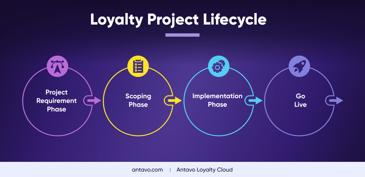
Revamping an Existing Loyalty Program
If you already have a loyalty program, which you want to improve by switching to a new loyalty technology provider (or simply want to improve your tech stack), then the process is more or less the same. It’s worth highlighting, however, that program revamps are generally much smoother, considering that program owners already are much more experienced in scoping, timeline estimation and process handling. Still, every success story begins with a great plan…
1. Locate old concept documents
Re-launching a loyalty program is more complex than simply copy-and-pasting everything from one place to another. The new provider needs to recreate the whole program structure from the ground up, which is why it’s a tremendous help (and progress booster) to have old concept documents on hand, or to bring in project managers who know the whole structure by heart.
2. Decide what should remain, and what should be improved
Update the concept document with your ideas on how to improve the system, the extra features you wish to add, and so on. These need to be scoped out with a Business Analyst, and not just added as a side note. Trying to add too many bells and whistles may postpone the launch date, so the rule of thumb is to copy as much from the existing program as possible, leave out anything unnecessary, and put together a solid MVP, which can be further expanded with new features later on.
3. Proceed with data migration
There’s an extra step between the scoping and the integration phase that is needed to be performed when revamping a customer loyalty program. It involves migrating the loyalty data to your new provider. This process requires thorough data mapping and may take longer depending on the number of data categories you wish to move. The best practice is to migrate customers, rewards, point histories and transaction histories.
If some rewards or benefits will disappear after your relaunch, maintain customer goodwill by converting old, unused benefits like coupons into points and add them to the customer’s new account so they start out with a good experience.
4. Preparing for the big shift
Performing the configuration and the UAT for existing program owners is generally smoother, since it’s not their first rodeo. Still, businesses during a program revamp should not be overconfident or set unrealisticly short deadlines, because the addition of unfamiliar features and structures can cause many unforeseen issues. And when the launch date comes, make sure to notify members about any downtime while the new program gets up and running behind the scenes. Once everything is in place, all there is left to do is push the big red button (for the second time), and kick off your brand new loyalty experience!
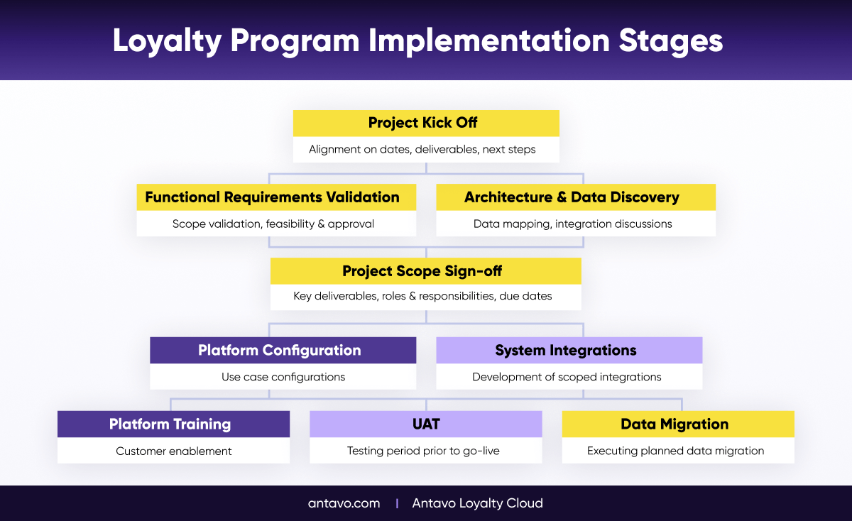
Key Takeaways & Actionable Insights
- The implementation process of a loyalty program is slightly different depending on whether it’s a revamp or the launch of your first program
- When launching your first loyalty program with a third-party vendor, make sure to run through your ideas with technical and strategic experts who have more experience building loyalty programs
- If you are revamping your loyalty program, you will likely be more familiar with the processes involved, allowing for more accurate predictions for the launch window
- Regardless of which category you belong to, a smooth implementation hinges on a well-rounded concept and scope
Step #12: Managing the Program Before And After Launch
At this point, your customer loyalty program is ready for the big unveiling. But before you officially open the gates for your customers, there’s a little more planning left to do. First and foremost, you need to organize a launch campaign to capture attention – not just from existing customers, but potential new members as well. Secondly, you need to start thinking about future rewards, holiday campaigns, upcoming features, new integrations…because the work of a loyalty program manager is never over.
Getting Ready for the Big Day
The launch of your loyalty program is probably the most important point in its history. The fresh experience will draw in many customers, and your brand will be on the top of their minds. But don’t take the hype for granted: for maximum virality, you should execute a grand campaign around it.
- Soft-launch the program with a small segment: Before going fully live, you can conduct a small-scale test involving a hand-picked selection of customers or brand advocates. This would give your advocates the chance to try something new and provide feedback, while allowing you to iron out bugs and adjust certain elements, like the point-price of a key reward.
- Arrange a marketing campaign: Announce your loyalty program launch in a newsletter, run Facebook ads, use retargeting, Google Adwords, or even create a promo video starring a C-level executive to drive interest.
- Launch with a bang: For the first few weeks, consider offering limited-time perks and bonuses, like double points on purchases, or a generous welcome gift. The FOMO will prompt customers not only to join, but also make a purchase so they don’t miss a great opportunity.
- Stay on standby for last-minute support: Behind the scenes, things may be shaky during launch. A massive influx of member interactions may reveal bugs or flaws that had not been discovered during the smaller-scale soft launch. Therefore, both your managers and IT staff should be on standby to manage any crisis situations.

Running a Loyalty Program Is a Journey
Having a loyalty program is one thing, but making it a success story is another. After launching your loyalty program, your first priority should be to task the appointed manager with a strategy to keep the program fresh. This includes, among other things:
- Analyze the results: Work with your finance team or your loyalty consultants to understand the results. Use the feedback to adjust program elements and communication to optimize your program.
- Run campaigns in the program: When rewards and activities end or get boring, new ones should be created to match ever-changing customer preferences.
- Evolve the program: Over time, new features and modules need to be added to the program structure to stay relevant and drive more KPIs. If you work with a third-party provider, your dedicated contact will keep you updated about the latest improvements and possibilities.
- Handle customer complaints: Answer customer questions and treat your most loyal customers with extra-special care. This will ensure they keep the faith in your brand.
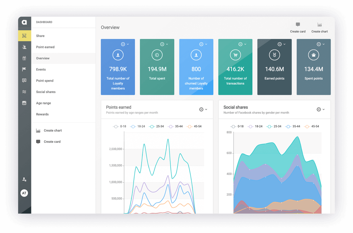
Key Takeaways & Actionable Insights
- In order to smooth out any rough edges before launch, consider testing the loyalty program with an insider group of brand advocates and top buyers
- Don’t forget to host a launch-day celebration and marketing campaign to attract as much attention as possible
- Your loyalty program needs a push after launch, too: so keep iterating on it based on feedback and internal analyses
Step #13: Avoiding the Most Common Loyalty Program Mistakes
At this point, the planning for your customer loyalty program should be wrapping up nicely. But before you go out and put it into action, let’s run through the whole concept to make sure it is fool-proof. Here are the most common loyalty program pitfalls you should try to avoid.
1. Being too pushy during enrollment
First impressions are often a dealbreaker. So why make the registration process (the introduction to your loyalty program) a slog? On one hand, it’s understandable: customer data is valuable, and you want to learn as much as you can about new members right away. On the other hand, an overly long enrollment page may scare away busy or impatient customers.
The best course of action to avoid this is to include only the essential information in the registration form: name, email address, password, and maybe the customer’s location. Then, once members are enrolled, offer them a reward — like bonus points or a small coupon — for completing their customer profile. At this point, you can ask all the questions you need because it’s in their best interest to answer all of them.
2. Your loyalty program concept is only one page long
We have written quite a lot about the importance of loyalty program concept. However, we didn’t really touch on how the concept document should look. Even though there is no ideal length, we are confident in saying that it should be longer than a single page.
In other words, DO go into the details. Don’t just write down the type of loyalty program you want. In case of a tiered program, clarify how many tiers you want, what their names and spend/point ranges should be, what kind of rewards should be associated with them, etc. When it comes to scoping, this kind of effort will really pay off!
If you haven’t already, make sure to download our handy worksheet for concept building.

3. Trying to launch with an overcomplicated program
Think about loyalty programs as a marathon, not a sprint. In this guide, we hope you’ve read about plenty of great features and strategies. But trying to launch with a bloated, untested program can have great consequences.
Instead, come up with a lean, yet innovative loyalty program MVP. It should have a solid, well-thought out structure and a list of great rewards, coupled with an extra-enticing feature (like a Prize Wheel, or a sport tracker integration) that acts as a selling point. And before going fully live, organize a testing phase where you invite your most valuable customers. They will love it!
4. Underestimating the power of referrals
Word of mouth is a powerful tool for any business. Customers will always value opinions from within their circle of friends more than marketing. Using a referral program seems like an obvious loyalty solution, yet many companies forget about this crucial feature.
Of course, there are a number of ways you can spice up your referral system, so you can differentiate your program. For example, you might start with a small reward rate, but the rewards will grow and grow after each referral, enticing customers to invite as many of their friends and family members as possible.
5. Forgetting to reward non-transactional activities
Some brands are afraid to take the risk with non-transactional engagement. But these worries are unfounded. Though rational (transaction-driven) loyalty programs still dominate the market, more and more businesses plan to revamp their loyalty programs in order to make them more emotional.
By the way, you don’t need to fully commit your loyalty program to this idea. You can start small by rewarding customers for referrals, or writing product reviews. Then later on, you can introduce more exciting features, like charity donations, once you learn the ropes.
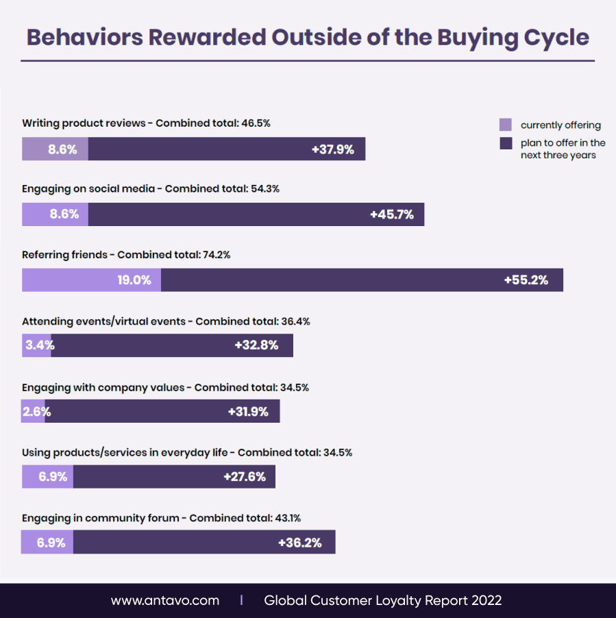
Key Takeaways & Actionable Insights
- Make enrollment quick and easy because you can get customer data in other ways
- Don’t be afraid to experiment and go beyond traditional transactional rewards, otherwise your program won’t stand out
- Referral systems are an easy opportunity to acquire new customers, just make sure to add a unique twist to the age-old formula
- Test, test, test! Before launching your loyalty program, make sure to gauge the reaction of a small, targeted audience
How Antavo Helps You
Creating a customer loyalty program in this day and age should be about more than just giving out points and coupons. It’s a one-of-a-kind opportunity to create an experience unique to your brand,s which your competition cannot replicate. We at Antavo are here to help you by offering a sophisticated, enterprise-ready loyalty technology.
Antavo is an industry-leading loyalty cloud that delivers an API-centric, no-code loyalty platform for omnichannel and eCommerce businesses, combined with unique in-store functionalities.
We build comprehensive enterprise loyalty programs to foster brand love and change customer behavior for brands, retailers, and shopping malls. With a scalable and holistic loyalty logic, Antavo supercharges omnichannel and eCommerce companies’ marketing strategy and delivers a next-level shopping experience. Our best-in-class capabilities engage loyalty program members wherever they are: online, in-store or on the go.
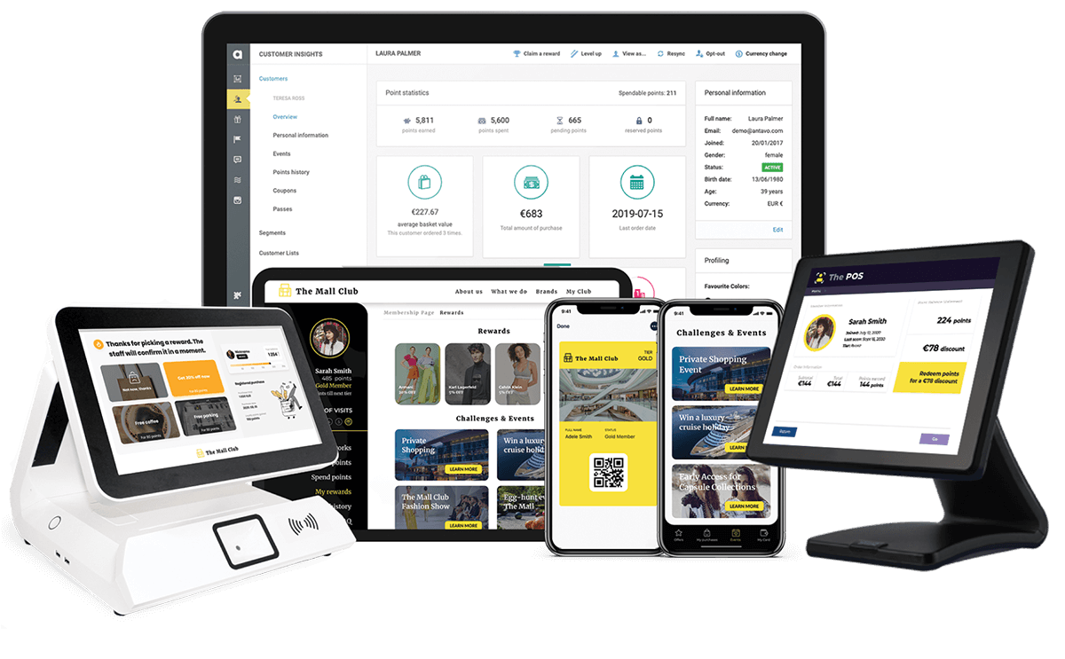
Why choose Antavo?
- We offer a no-code platform tha allows you to iterate your customer journeys without the help of the IT team.
- Antavo system is ISO 27001 certified, and we perform regular penetration tests. Security, performance and scalability are at the top of our agenda.
- To ensure that implementation and management are done seamlessly, we empower integrators’ and agencies’ success with unique training materials, lessons and certified courses.
- Thanks to its API-centric technology, Antavo easily integrates with a wide range of technologies, including CDPs and marketing automation platforms.
- You can find a best-fit loyalty solution no matter which industry you are in, as we have 10 different loyalty program structures to offer, all of which can be customized to go outside of the buying cycle.
- Antavo has issued quarterly product releases since 2018, and invest 60% of their revenue into the product.
- In addition to eCommerce, we support retailers, malls, department stores, airports and other multi-tenant environments.
- If you are looking for a seamless omnichannel experience, our platform offers plenty of unique customer journeys, including gamification, lifestyle elements and experiential rewards.
- Antavo has been recognized by Gartner and Forrester in their respective annual reports.
Antavo’s global clients include BMW, KFC, Lagardère, Kathmandu, BrewDog, Mercury, GetPlus, League, the N Brown Group, and LuisaViaRoma – and our loyalty technology contributed 16% growth in revenue for the latter.

If you’re interested in learning more about customer retention trends, next-gen loyalty program features as well detailed guides about our technology, you’ll find plenty of reading material in our blog section.
Looking for inspiration and client success stories? Our case study section welcomes you with open arms. And, on our YouTube channel, we share loyalty discussions and tutorials that showcase our latest tech.
Hopefully, you found this guide useful. Loyalty programs have the power to create great experiences that can change the way people interact with your brand — and change the way you think about loyalty. Our team is wishing you plenty of luck and success in planning and running your own customer loyalty program.
Ready to put what you have learned into action? Our highly trained experts would be more than ready to help you bring your ideas to life using Antavo’s enterprise technology. Simply book a demo or send us an RFP!
And don’t forget to download our customer loyalty reports. These in-depth documents showcase dozens of statistics and highlight future industry trends that will help you navigate the world of next-gen loyalty programs


